

The Problem
While working at Marin Software, we acquired a display ad retargeting company named Perfect Audience — a self-serve banner retargeting platform built for small and medium businesses looking for a lower-cost alternative to search advertising. At the time of the acquisition, their management team, and even individual contributors, were very hesitant to update the content on their site or refresh its look. The SEO was performing well and the business was running steadily, so there wasn't a perceived need to make changes. A few years later, the Marin Software management team and a new general manager finally recognized that the business might do even better with an up-to-date marketing site.
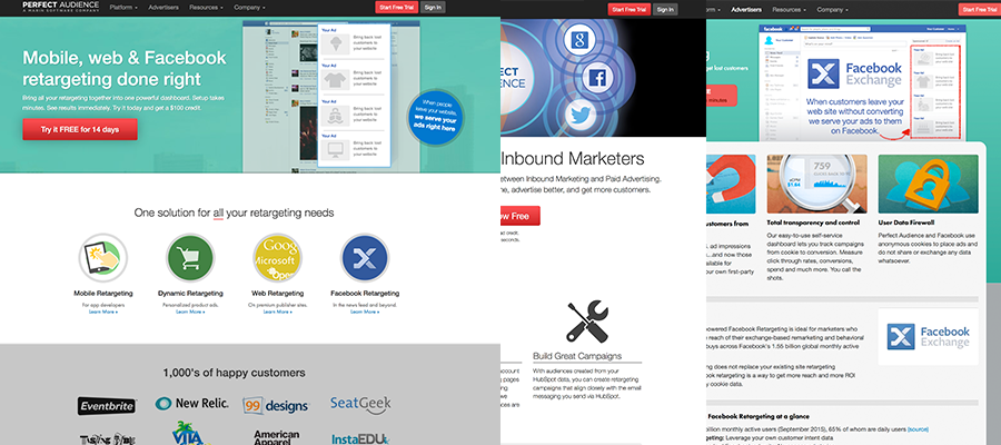
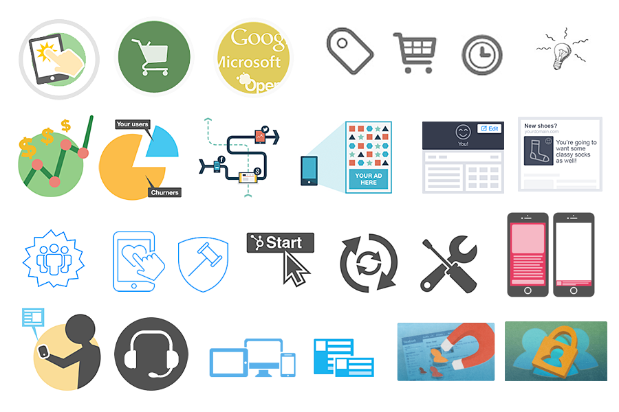
The team had added pages over the years as they added products and features, which led to significant inconsistencies as users navigated from page to page. Visitors had to reset their context almost every time they landed on a new page. After reviewing the site, we found the content structure was all over the place, layouts were inconsistent across pages, and icons had been designed in over ten different styles — as if ten different designers had each done their own take. The site looked dated, likely designed around 2010, and hadn't kept pace with the product's evolution.
Four years earlier, after running into a number of roadblocks and with limited resources available, our team had decided to focus efforts elsewhere and let the site run its course. We weren't looking to blow it up entirely — just modernize it and bring it in line with our other Marin web properties – marinsoftware.com, insights.marinsoftware.com, support.marinsoftware.com.
Flash forward four years: I returned to Marin Software to take care of a number of special projects, and after completing those, the Perfect Audience redesign landed on my plate. The business was gaining traction, and the need for a refreshed marketing site was more urgent than ever.
Goals & Key Results
Before diving into research and design, the team aligned on a clear set of objectives and measurable outcomes to define what success looked like for this project.
Objective: Improve the Perfect Audience marketing site to drive business growth
User Experience
- Reduce average pages visited before conversion by 20%, reflecting a clearer, more navigable content structure.
- Increase average session duration by 15% as users engage more deeply with better-organized content.
- Reduce bounce rate by targeting visitors who previously left due to confusion or inconsistent page experiences.
Design Consistency
- Consolidate page layouts from 10+ inconsistent templates down to 4–5 standardized, modular layouts.
- Reduce icon style variants from 10+ down to a single unified visual system.
- Achieve a consistent visual language score of 8+/10 in stakeholder and user reviews.
Business & Conversion
- Increase free trial signups and demo requests by 25% within 60 days of launch.
- Improve lead quality for the in-house client services team pitching retargeting to Marin's larger clients.
- Reduce time-to-decision for SMB visitors, measured via heatmaps and scroll depth data.
Content & Maintenance
- Reduce time to publish a new product page by enabling non-developer content updates with zero engineering support.
- Set up the site so that a production coder or designer could go in, update content, or add new pages with minimal friction.
Technical Performance
- Achieve a Google PageSpeed score of 85+ on both mobile and desktop.
- Maintain or improve existing SEO rankings for top 10 keywords within 90 days of launch.
Users & Audience
The primary audience for the site was performance marketers, mostly from small and medium businesses comparing low-cost online advertising products and channels. These were hands-on practitioners who ran their own campaigns day-to-day. They needed to digest information from the site quickly and decide whether it was worth testing the product — which meant the redesign had to reduce friction in that decision-making process. Every additional page they had to wade through before finding a clear answer was a potential dropout point, making the 20% reduction in pages-to-conversion a particularly meaningful target.
A secondary audience was Marin Software's internal client services group, which ran ads for some of Marin's larger enterprise clients. This team was actively pitching display ad remarketing to clients as a lower-cost alternative to search. They needed polished, credible content to walk marketing managers through the retargeting offering across multiple channels. For this group, lead quality and ease of sharing content were the more relevant success metrics.
Team & Role
I executed the research, information architecture, wireframing, visual design, and front-end coding of the site, and also edited content to fit the new structure. I ran all work by our Creative Director, the Managing Director of the Perfect Audience business unit, an engineer on the product team, and the product manager. The product marketing manager and our editor wrote and edited three new product and feature pages for the site.
The Design Process
I reviewed a list of competitors the team forwarded and also sourced inspiration independently. One standout was Recurly, which used a subtle isometric parallax effect that added visual depth without overwhelming the content. I then pitched the team on architectural adjustments and proposed a more consistent, modular content structure.

After auditing the existing content and reviewing well-structured competitor sites, we determined we only needed 4–5 distinct layouts to cover the entire site — a direct answer to the design consistency key results we'd set at the outset. I wireframed those layouts and got team buy-in with minimal revisions on the first pass.
Version 1 – The Angled, Isometric Approach
Drawing on the Recurly inspiration, Version 1 used angular hero sections with a parallax effect and line-based icons to complement the text. While visually interesting, the screens started to feel repetitive, and the icon style risked feeling dated by the time the site shipped.

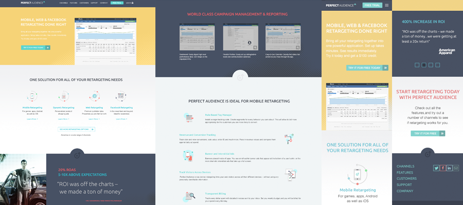
Version 2 - Introducing Some Color
Version 2 introduced a broader color palette and halftone patterns for visual texture. Icons were redesigned in a flat style to avoid the thin/thick line trend that was already showing signs of aging. This gave the client a meaningful alternative to evaluate.
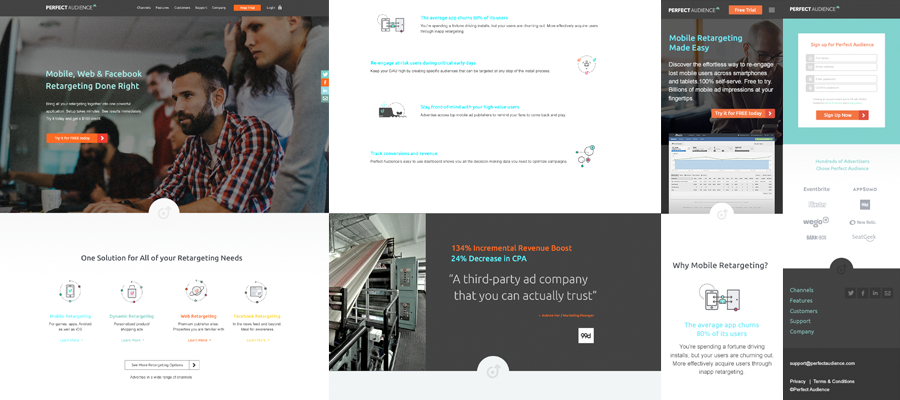
Version 3 - A Photography-Based Approach
Version 3 presented a more conservative direction that relied on photography in hero sections rather than illustrations or product screenshots. Given the limited budget, this would mean stock photography — but it offered a grounded, professional feel as a contrast to the more illustrative approaches.
Version 4 - Merging the Best of All Three
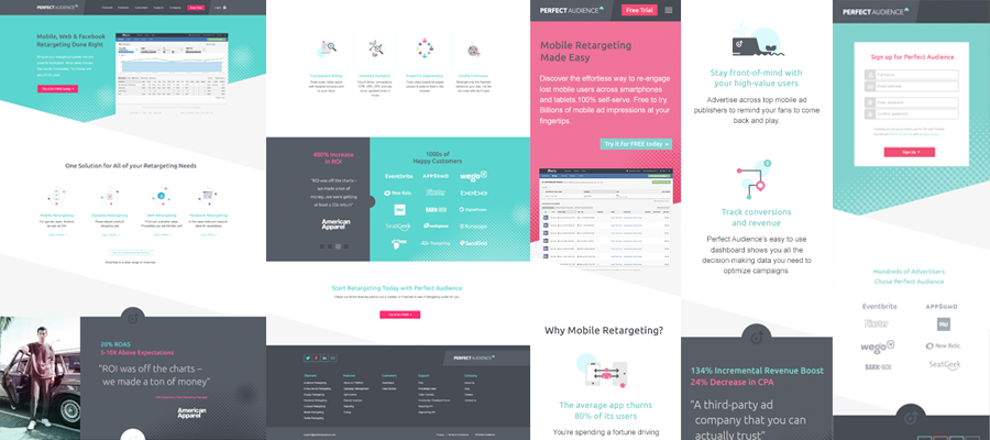
After reviewing all three directions with our Creative Director, we iterated with incremental refinements before presenting to the Perfect Audience team. During that presentation, we were leaning toward Version 1 when I suggested trying to merge the strongest elements from all three versions: the angled boxes, halftone patterns, flat icons, and broader color palette. I wasn't sure it would work — combining that many visual elements is a risk — but it was worth exploring. We went with this direction, and it became the design that shipped.
The Coding Process
Before the research phase even began, I had a conversation with our Creative Director and the Perfect Audience engineering team about what was working on the existing site and what wasn't — specifically why the site had gone so long without updates and why content inconsistency had become such a problem. Protecting the site's existing SEO performance was a hard constraint throughout, meaning any architectural changes had to be managed carefully to avoid disrupting rankings.
After that alignment, we decided to keep the technical implementation simple: a Bootstrap-based responsive build deployed on WordPress. WordPress gave us handy shortcode support, flexible menu management, and built-in SEO features — and while the team wasn't going to be updating it like a blog, it made the site maintainable enough that a production coder could go in and update content periodically without engineering support. That directly addressed the maintenance key result we'd set at the start of the project. A designer or developer who knows how to code could add new pages as needed, and simple content edits could be made without touching the underlying structure.
Outcome
After navigating a few back-end and operational headaches, the site launched successfully. The new architecture brought the page layout count down to the 4–5 modular templates we'd targeted, the icon system was unified, and the content flow was significantly more coherent for both SMB performance marketers and the internal client services team pitching retargeting to enterprise clients. I moved on from the project shortly after launch, but heard back that the site was performing well.
The project reinforced a few important lessons. Implementing a challenging design in code is harder than it looks on a mockup — working through that alone gave me genuine empathy for the developers I've collaborated with over the years. I also learned that even a well-considered responsive design leaves a long tail of edge cases at odd breakpoints; working through those requires both creative problem-solving and tight collaboration between design and development — even when, as in this case, those two roles were the same person.