
UI/UX/Visual Design


Sample of Work

Feature / 2023
View work
iPhone App / 2015
View work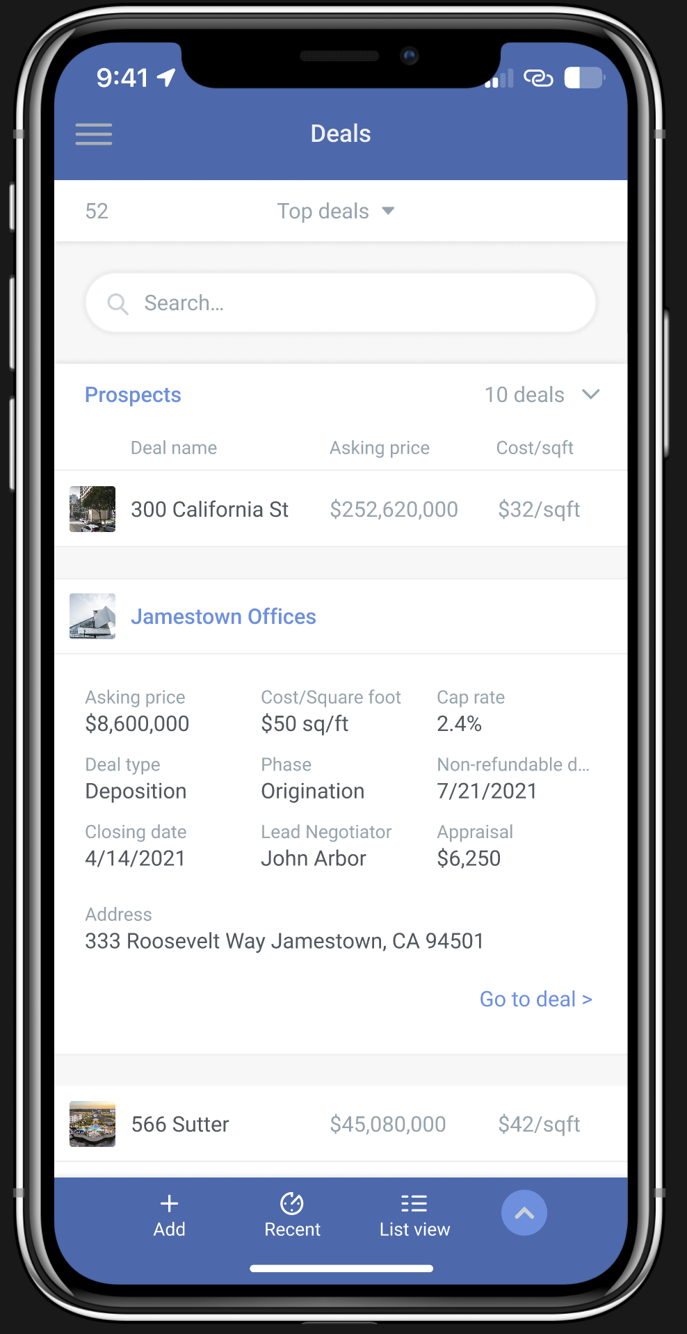
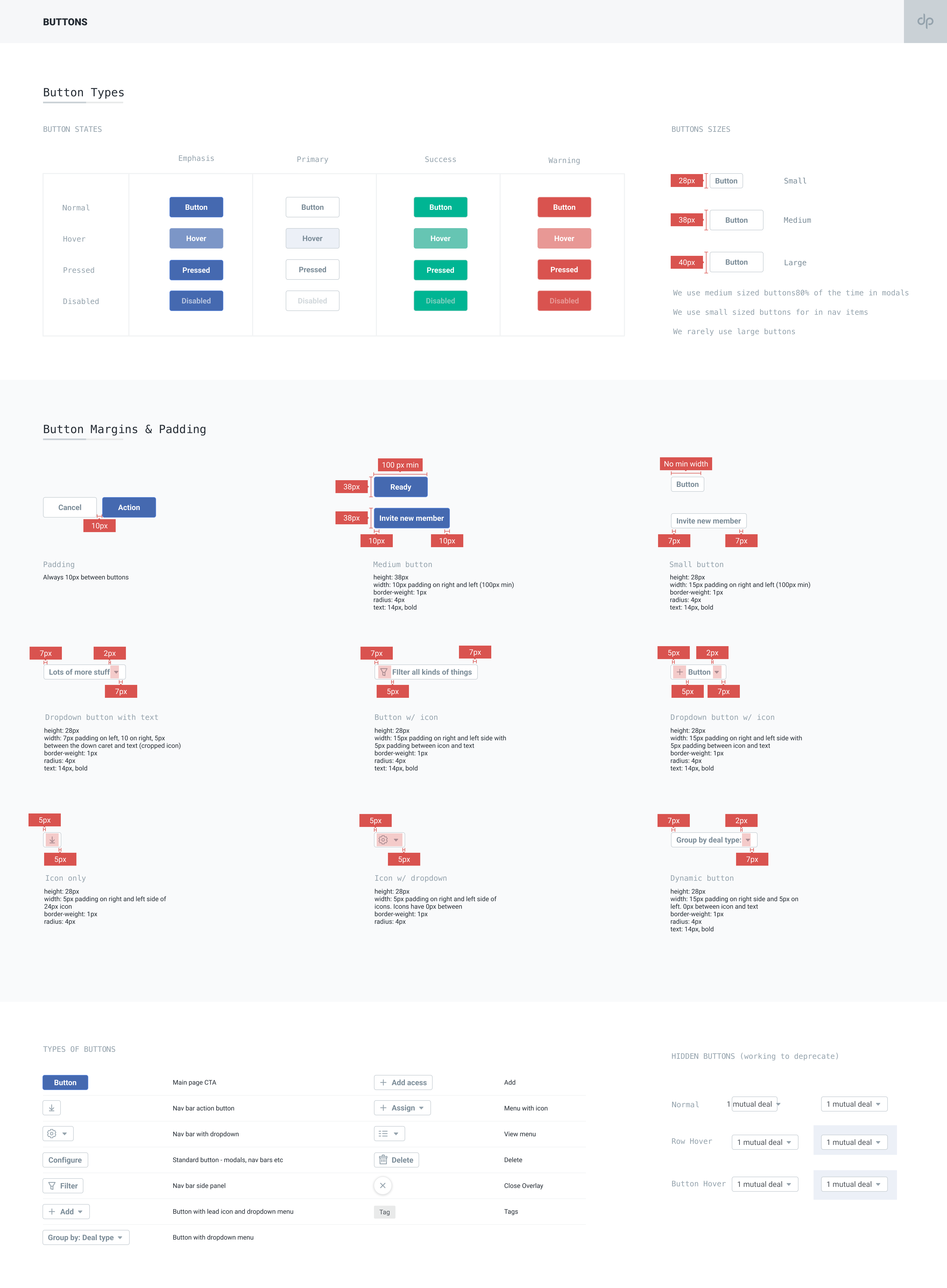
Design System/Library / 2020-2021
View work
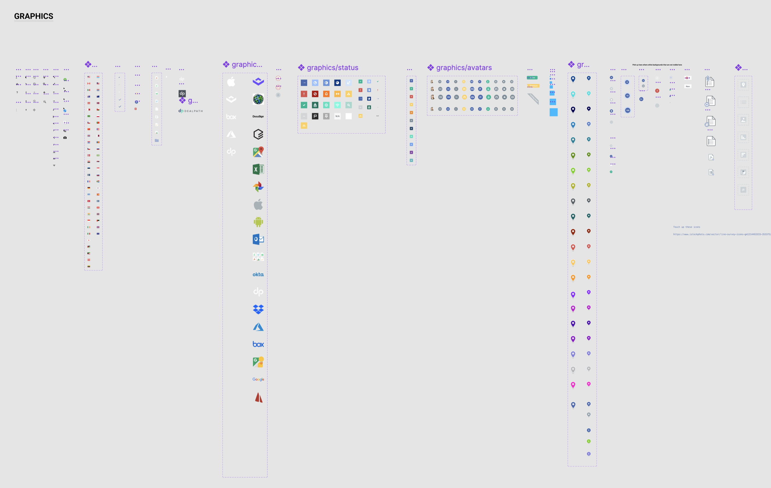
Design System /Library / 2019-2024
View work
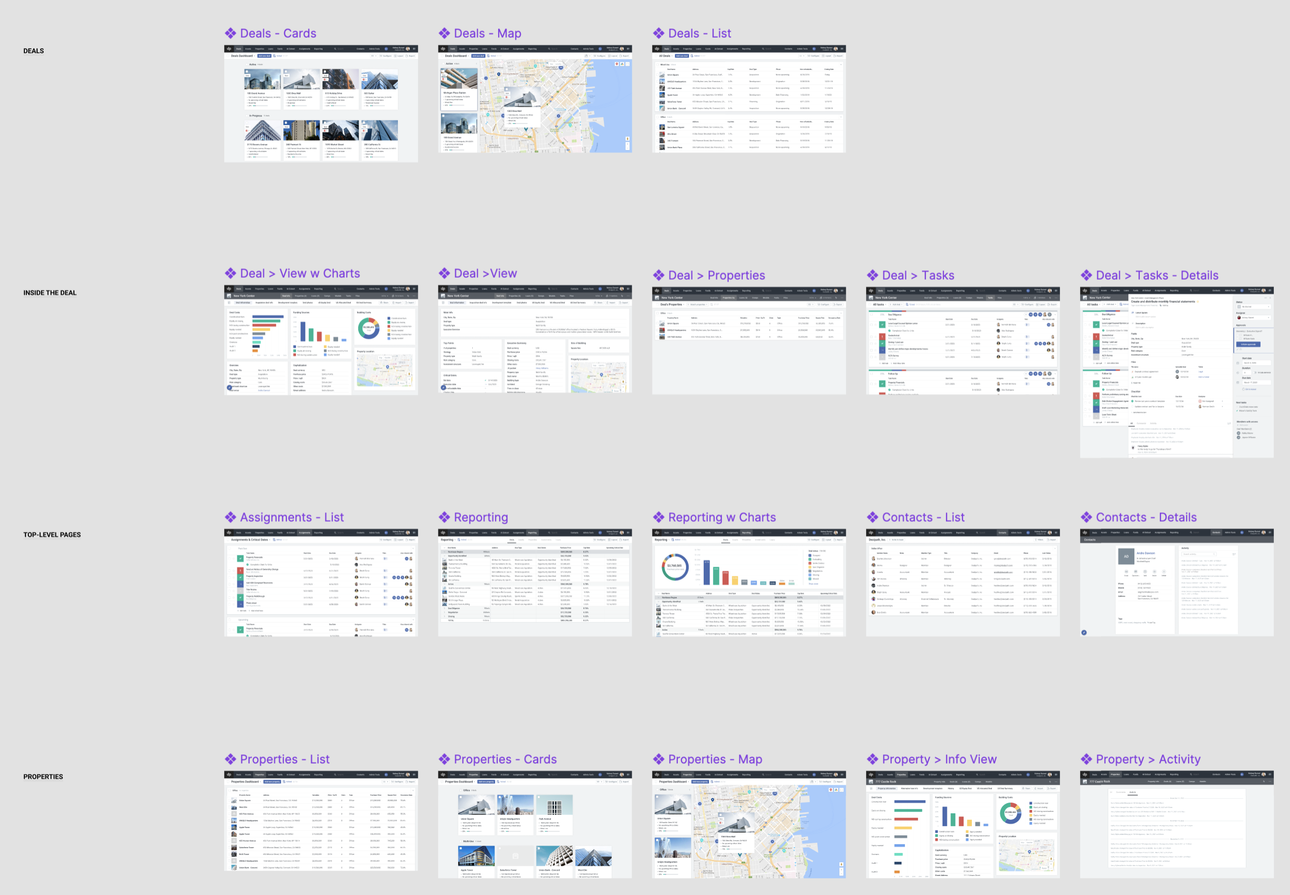
Desktop App & Library / 2019
View work
Feature / 2023
View work
iPhone App / 2019
View work
Web site / 2018
View work
Web application / 2017
View work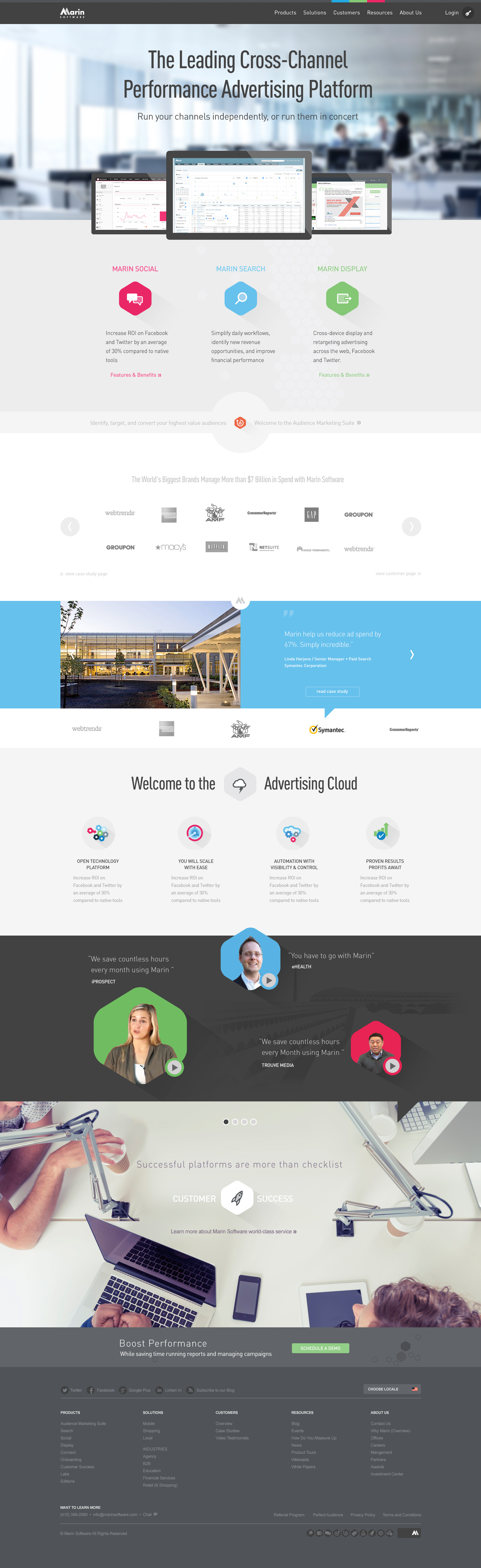
Site Redesign / 2015
View work
Animation / Video / 2014
View work
Web Design / 2017
View work
UI / 2017
View work
Infographic / 2013
View work
Icons / 2019
View work
Icons / 2017-2018
View work
Print / 2013
View work
Animation / Video / 2010
View work
Style Guide / 2016
View work
Web Site / 2011
View work
Userflows / 2017
View work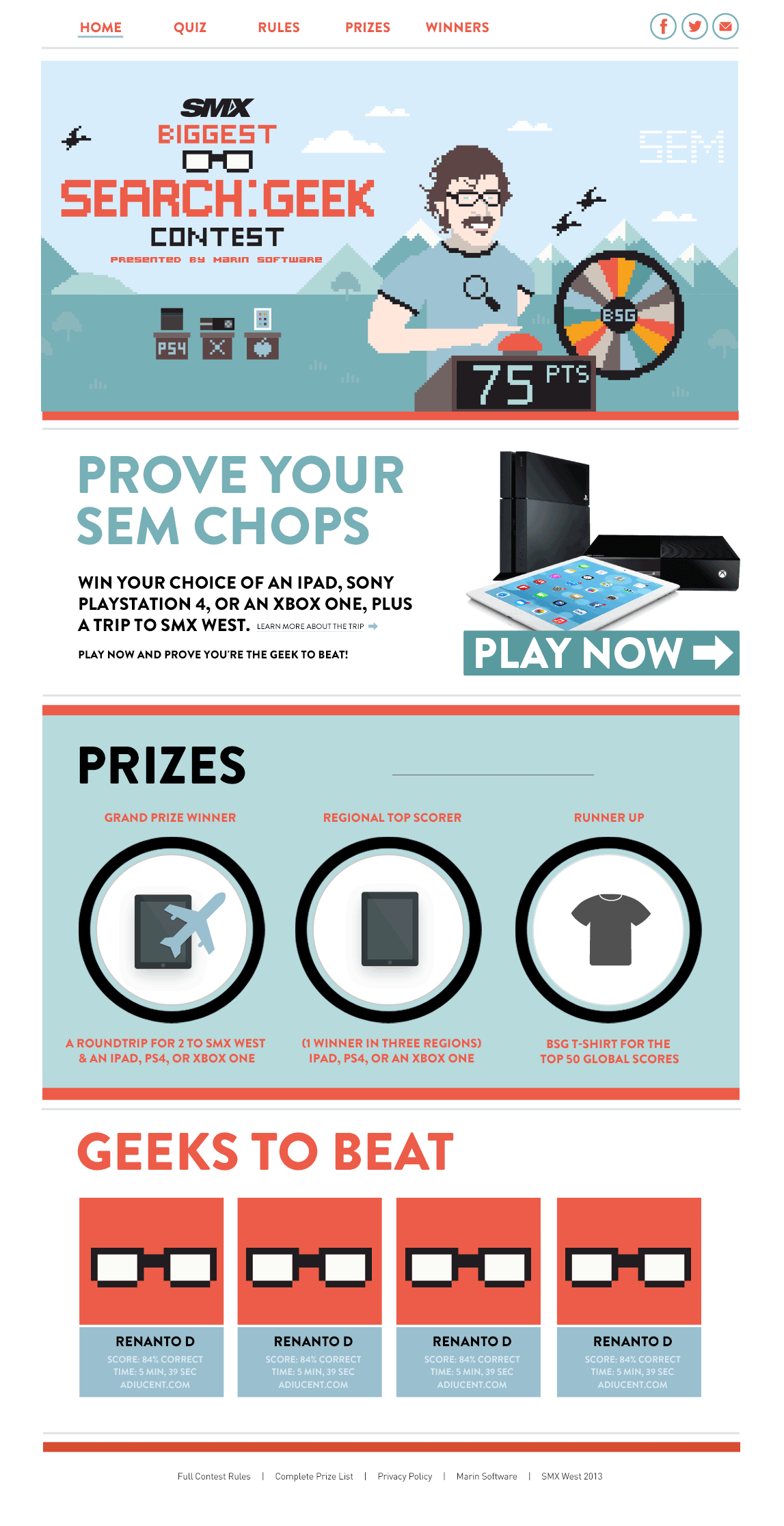
Web Sites / 2009, 2014 & 2015
View work
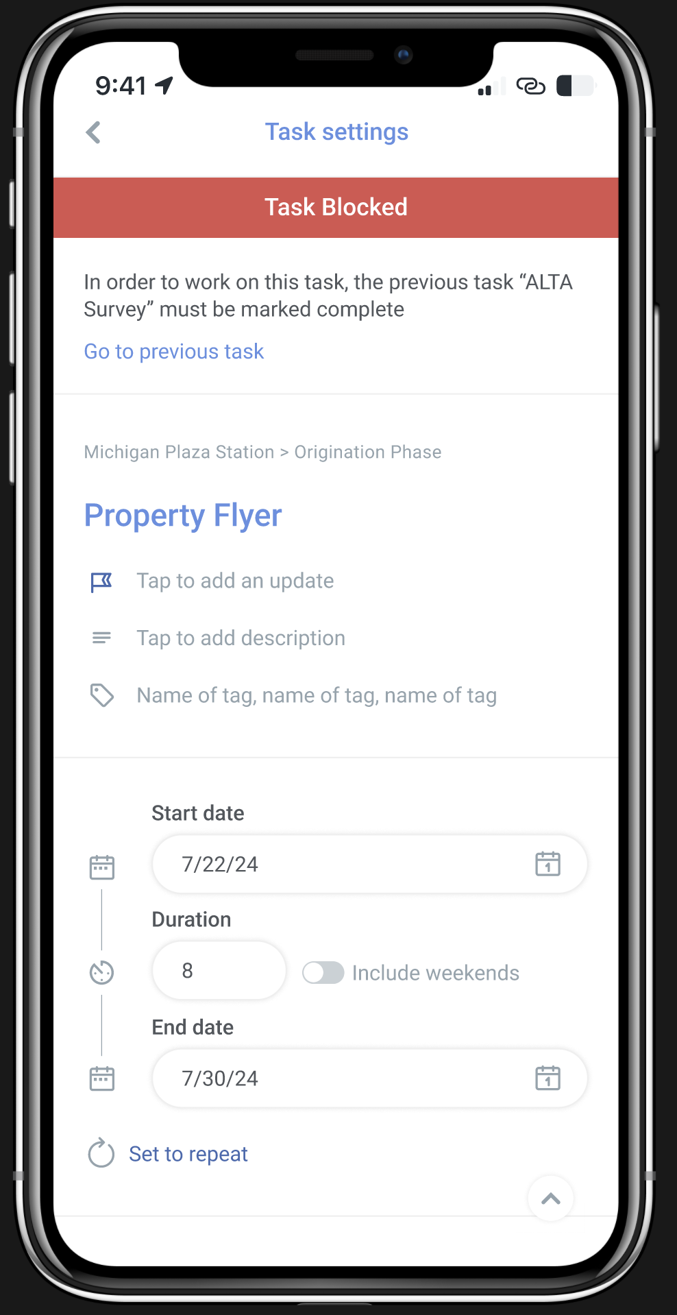
Feature / 2023
View work
Feature / 2022
View work
Feature / 2026
View work
Feature / 2024
View work
Feature / 2026
View work
Infographics / 2009-2017
View work
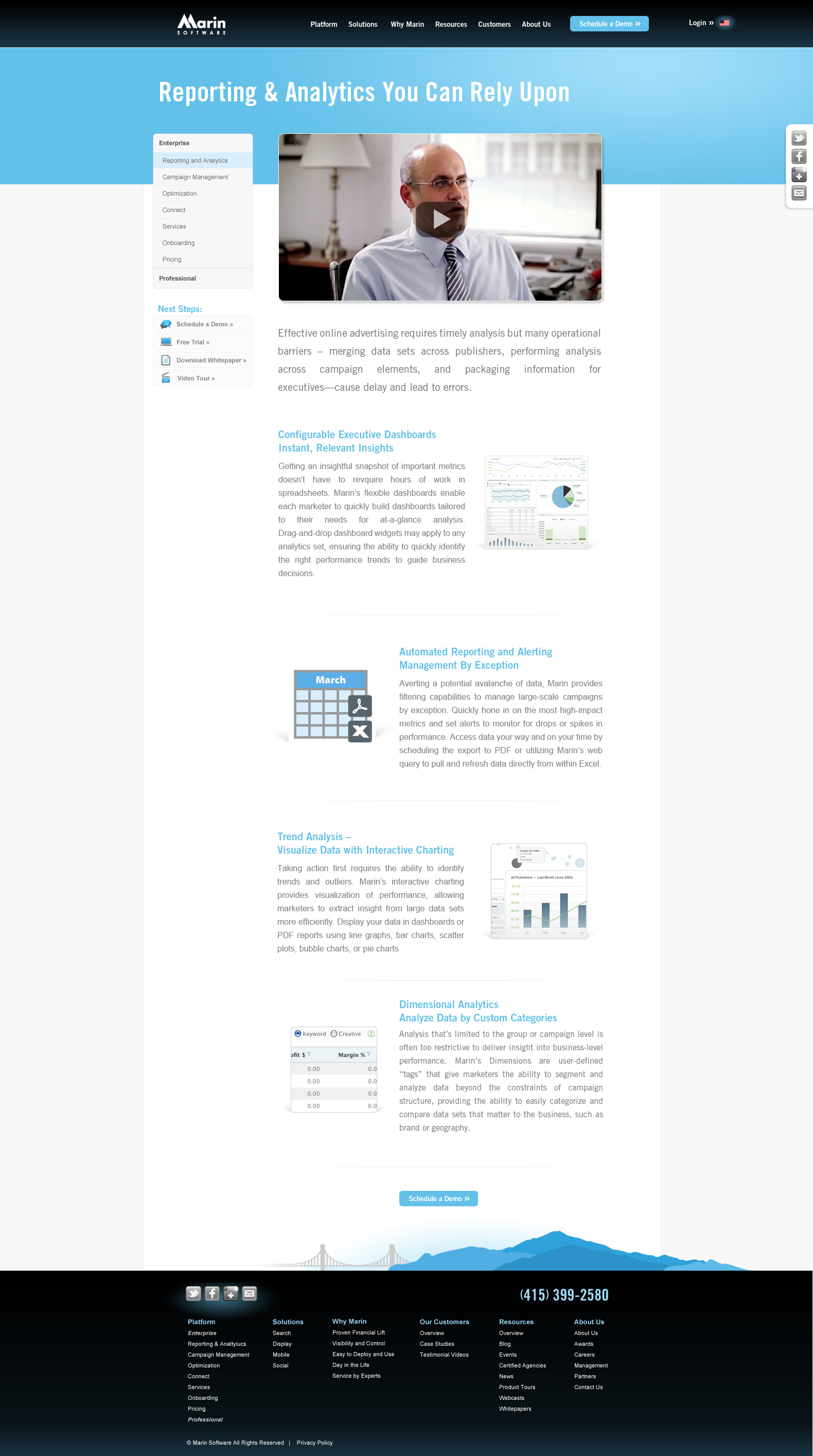
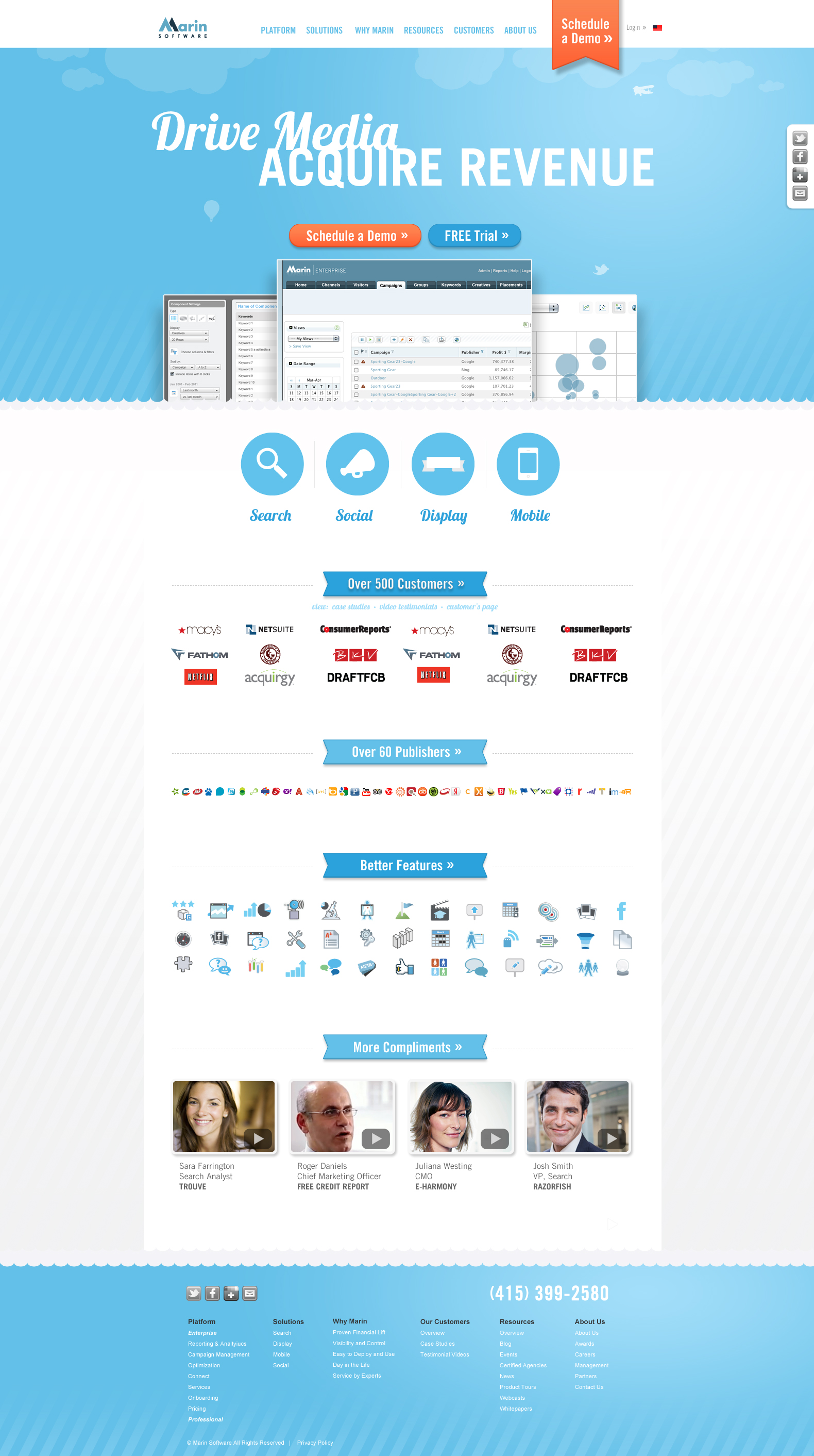
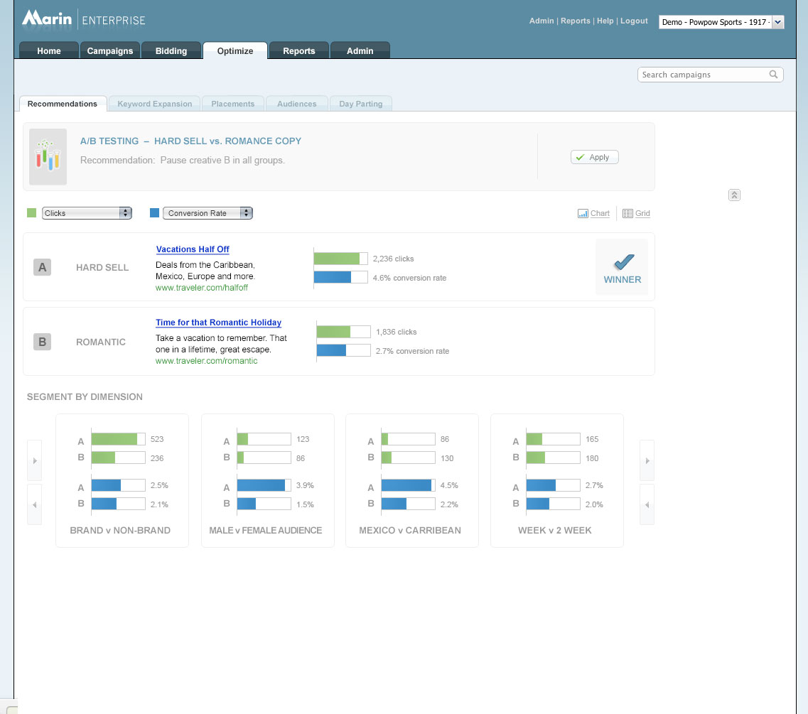
Marin / 2008-2016
View work
Infographic & White Paper / 2016
View work
Icons / 2016
View work
iPhone App / 2009
View work
Mockups and Interaction / 2017
View work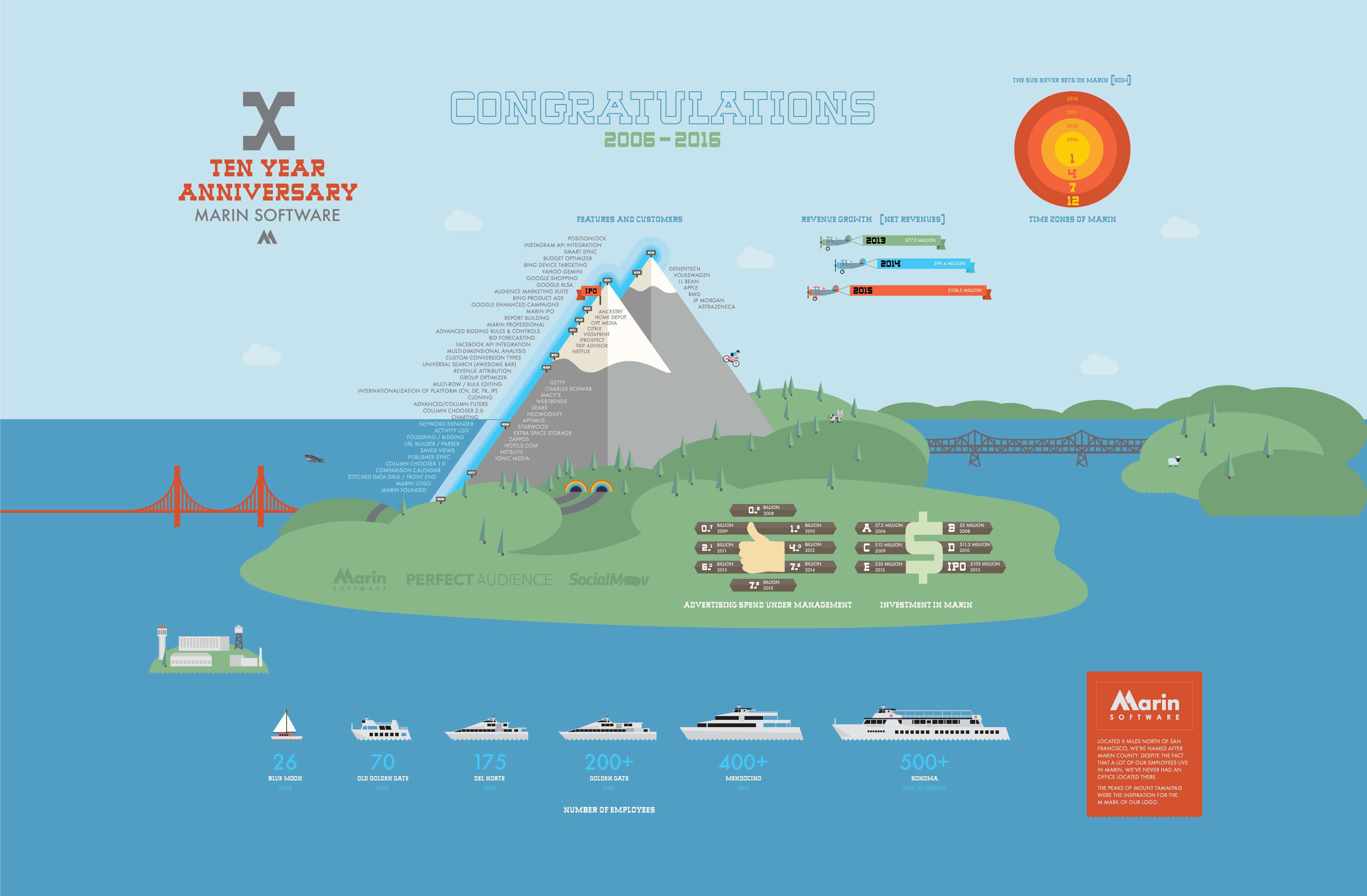
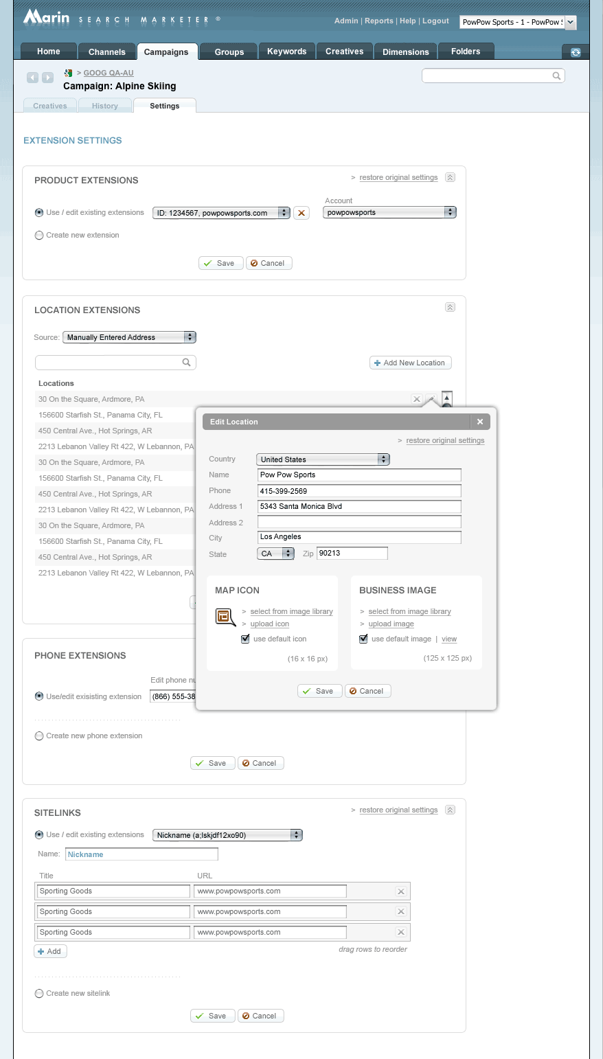
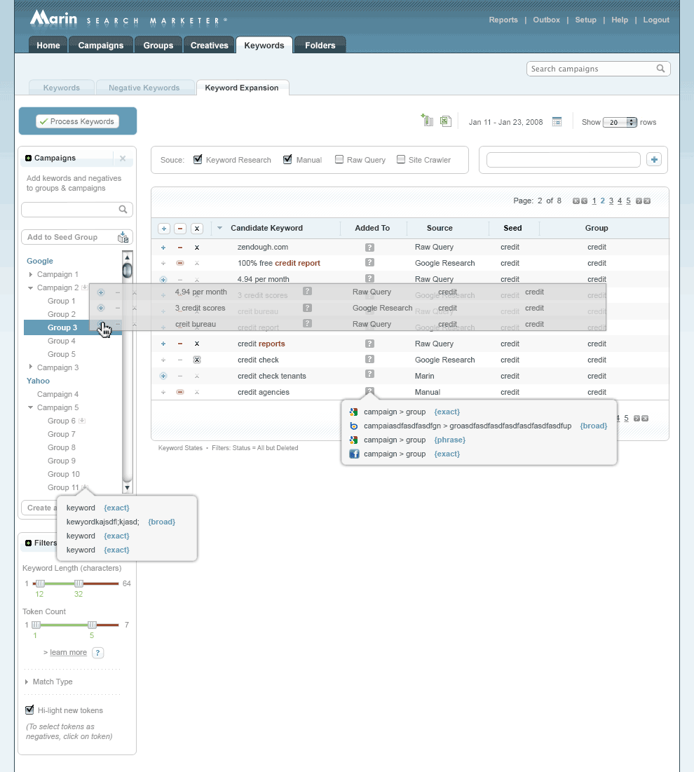
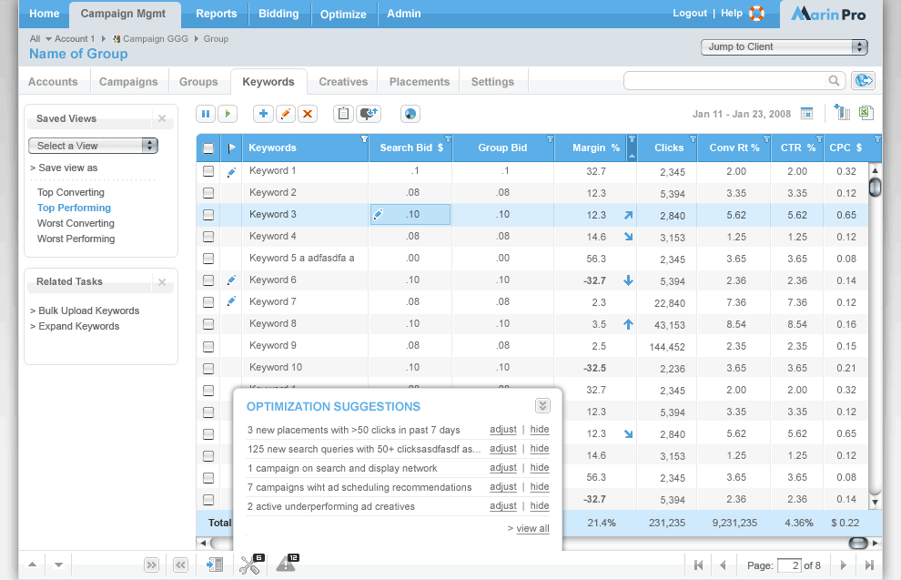
Marin / 2011 – 2018
View work
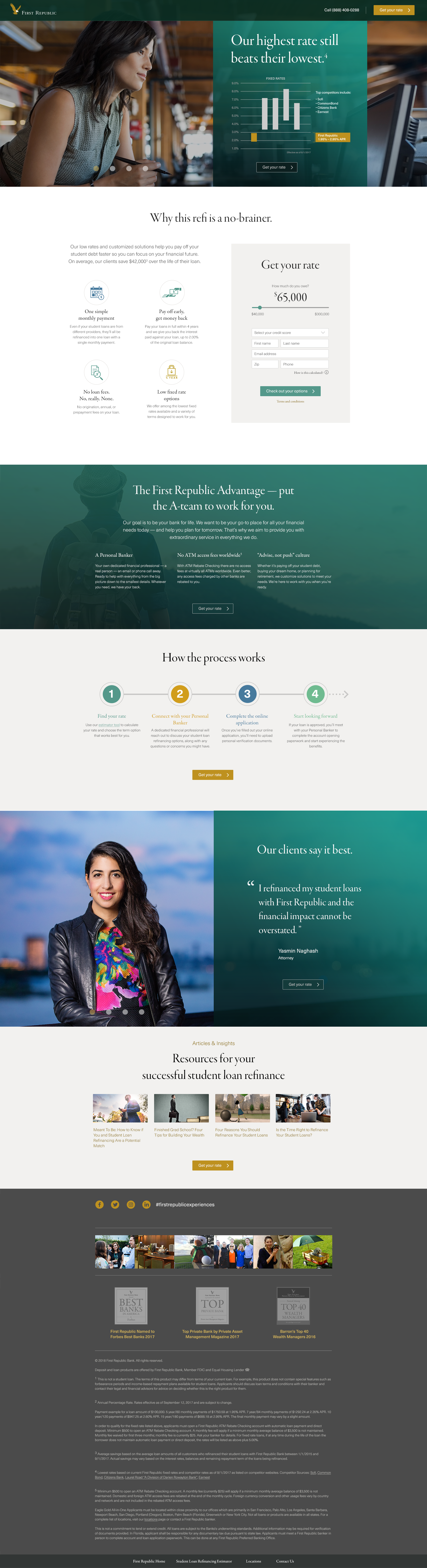
Landing Page / 2018
View work
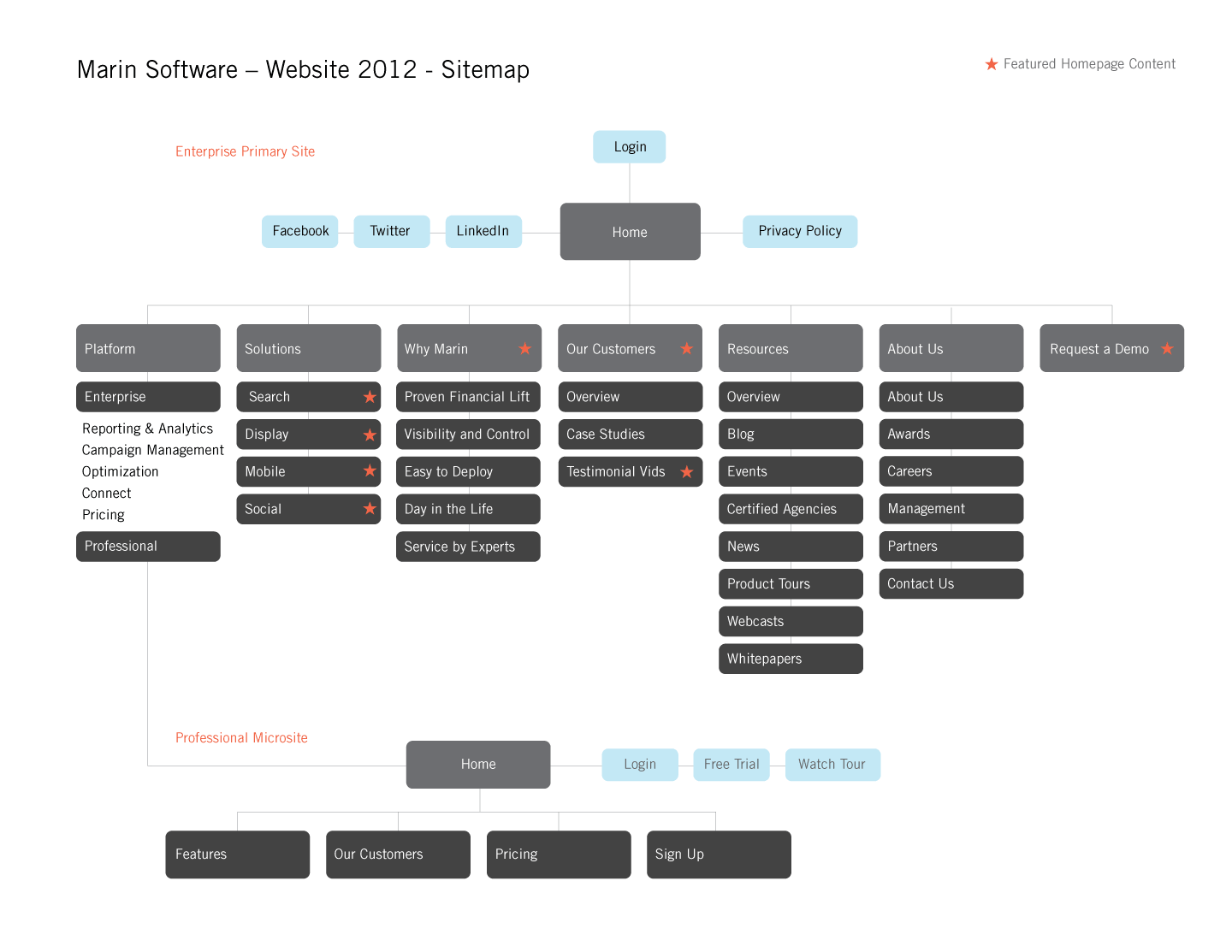
Web site / 2012
View work
Blogs & Collateral / 2014-2017
View work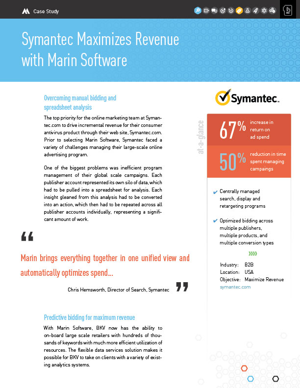
Template / 2013
View work
Print / 2012
View work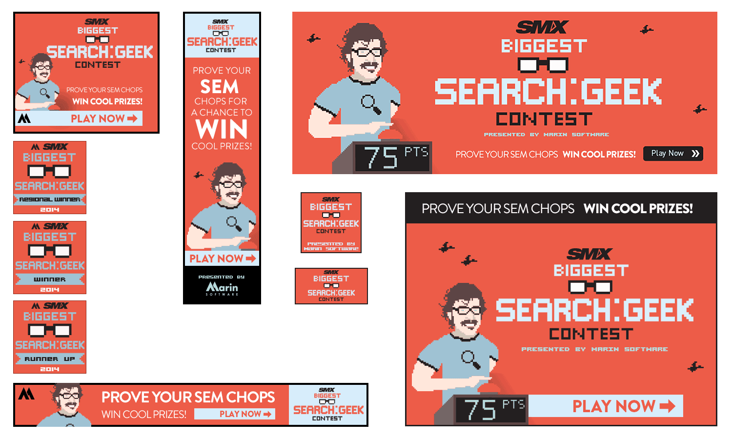
Banners / 2014
View work
UI/UX / 2006-2010
View work
Template / 2013
View work
Icons • Animated / 2016
View work
Icons / 2017
View work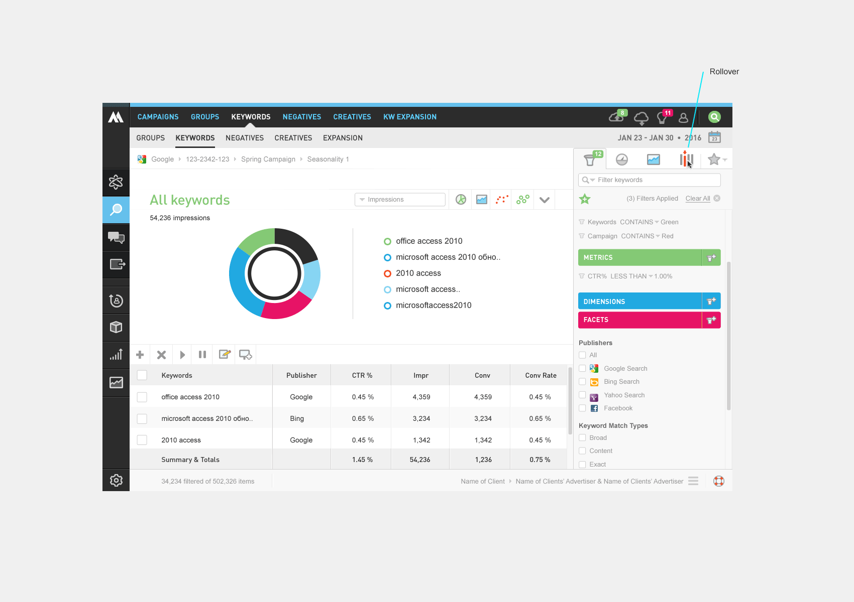
App feature / 2015
View work
Powerpoint / 2012-2017
View work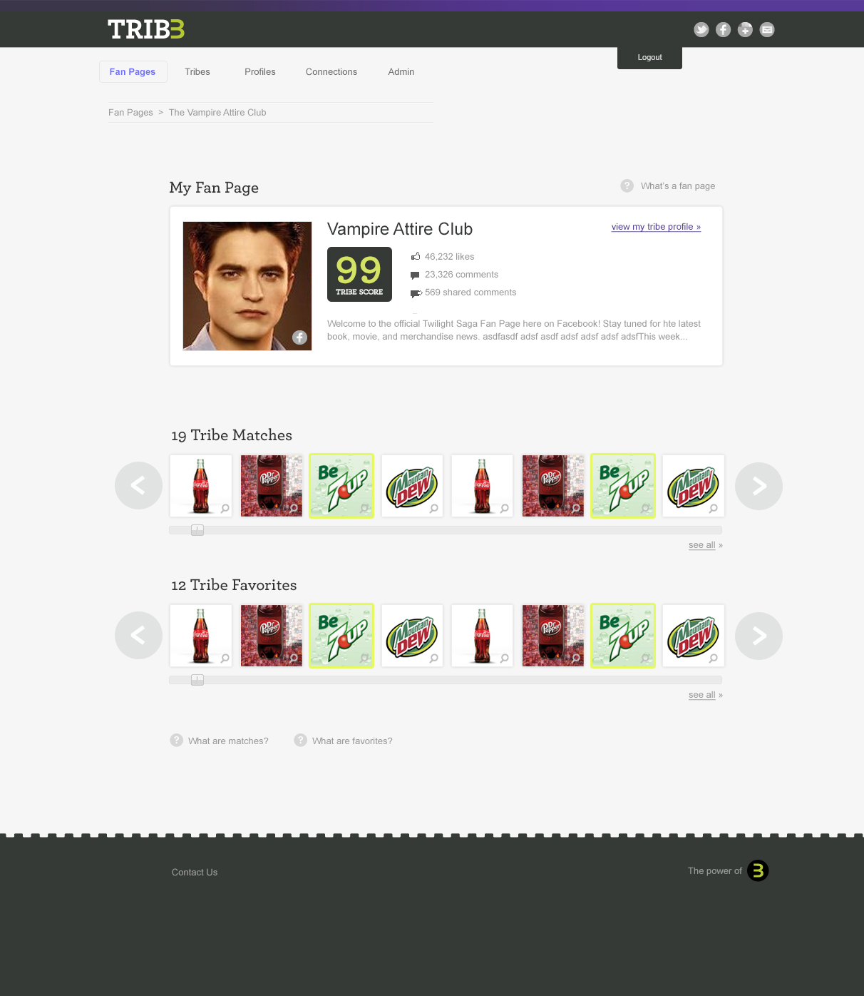
SAAS App / 2011
View work
Web site / 2017
View work
Web site / 2010
View workJack of all trades, master of many


figma
expert / 4 years

figma make
expert / 1 year

design systems
expert / 7 years

sketch
jedi / 7 years

invision
jedi / 7 years
RIP

photoshop
expert / 10+ years

illustrator
expert / 10+ years

css
expert / 10+ years

javascript
seasoned / 8 years

html
expert / 10+ years

wordpress
expert / 8 years
employee #1 designer at marin software – helped grow from startup to successful ipo
built multiple design systems, establishing design foundations that scaled
designed and shipped full ios apps from concept to launch at multiple companies
10+ years of hands-on product design across b2b saas, marketplaces, enterprise platforms
developed advanced prototyping workflows that reduced rework and accelerated customer validation
pendodecenthandle2years mixpanelseasoned4years fullstoryseasoned6years googleanalyticsoptimizely10+years optimizelyoptimizely4years jiradecenthandle8years asanaexpert6years filemakerproexpert10+years flintoexpert3years zeplindecenthandle1year pptseasoned10+years finalcutprohasadecenthandle3years wordpressexpert8years
Feel free to download and distribute. If you have any questions,
feel free to contact me.
Clients / Partners / Employers
CASE STUDIES
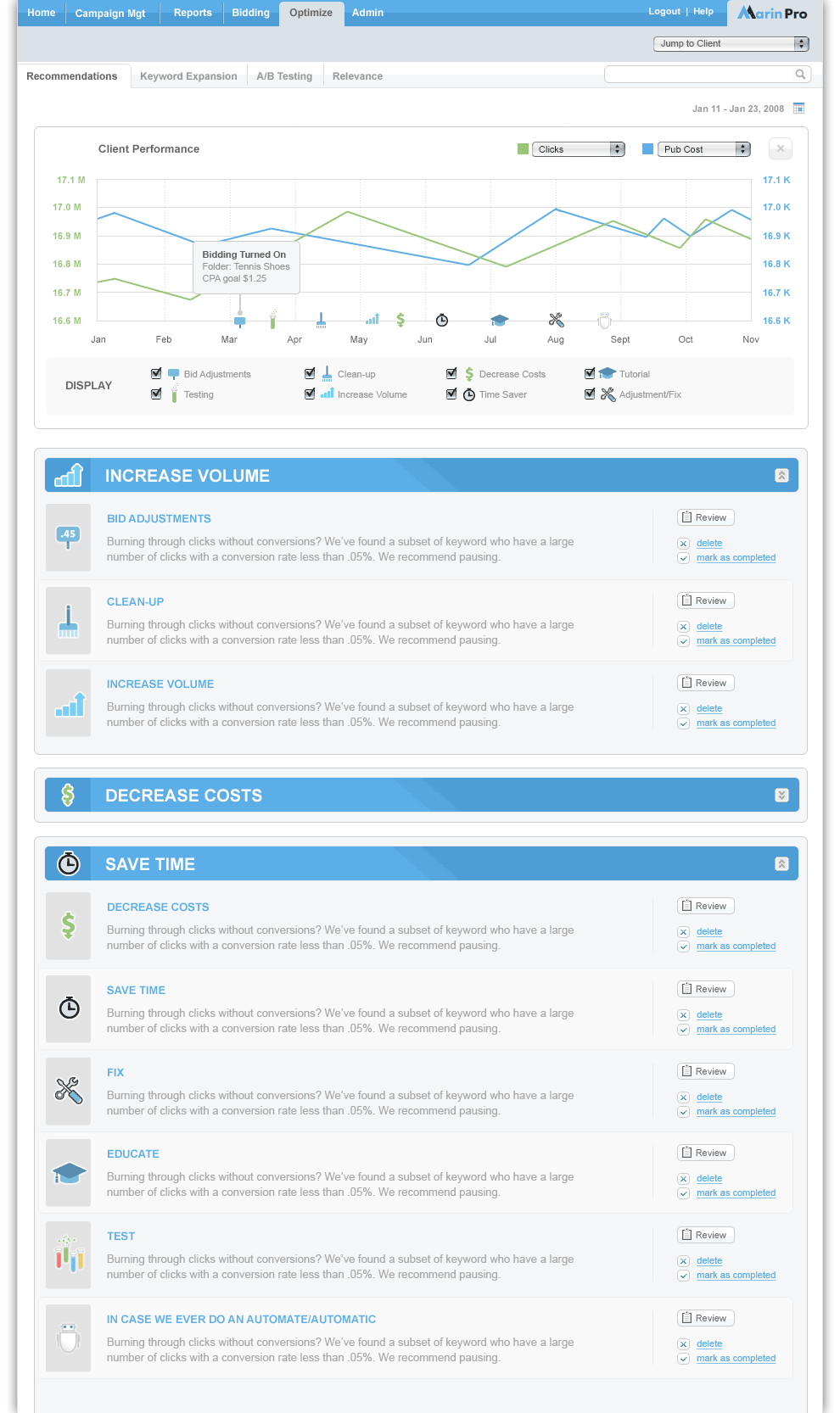
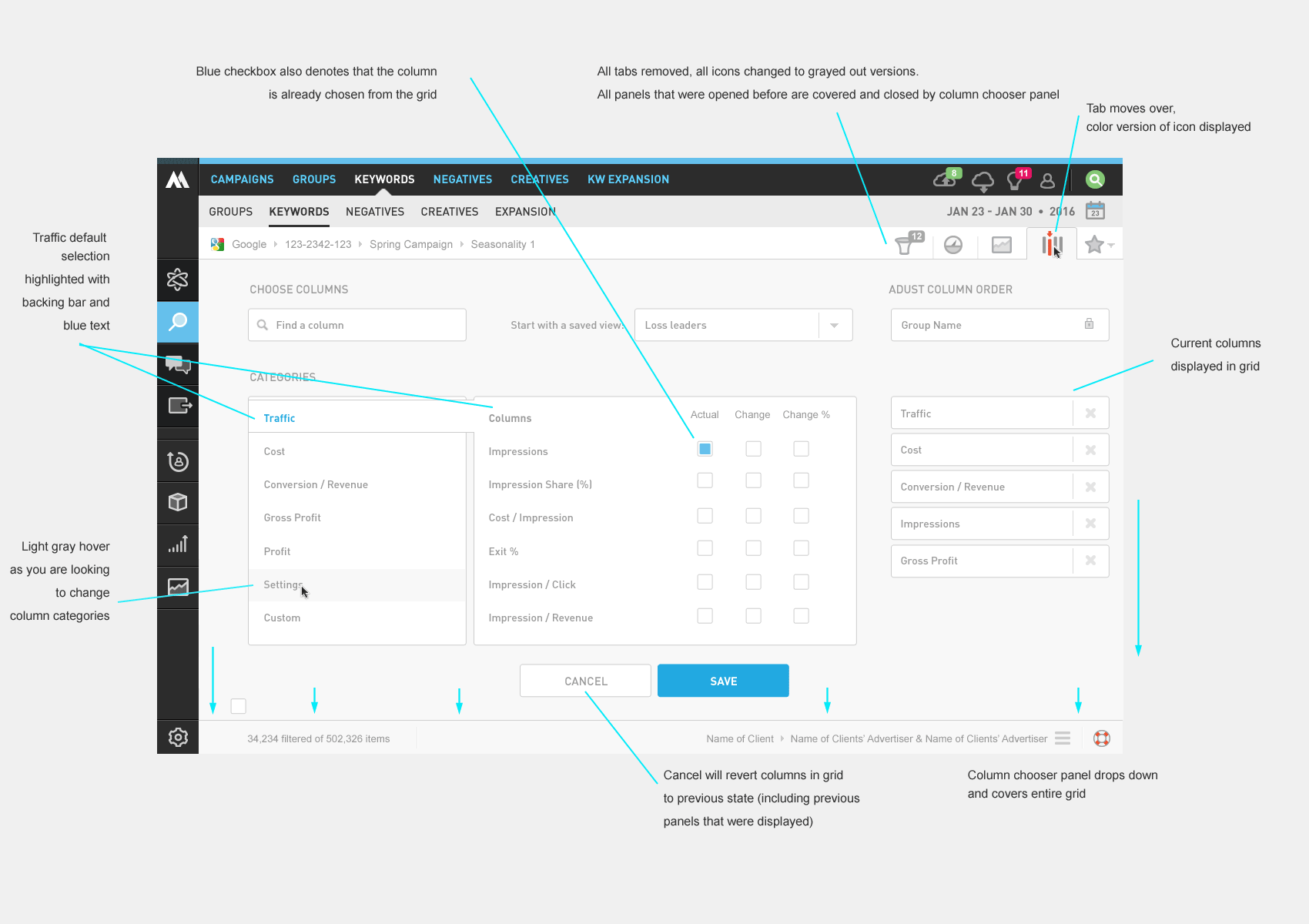
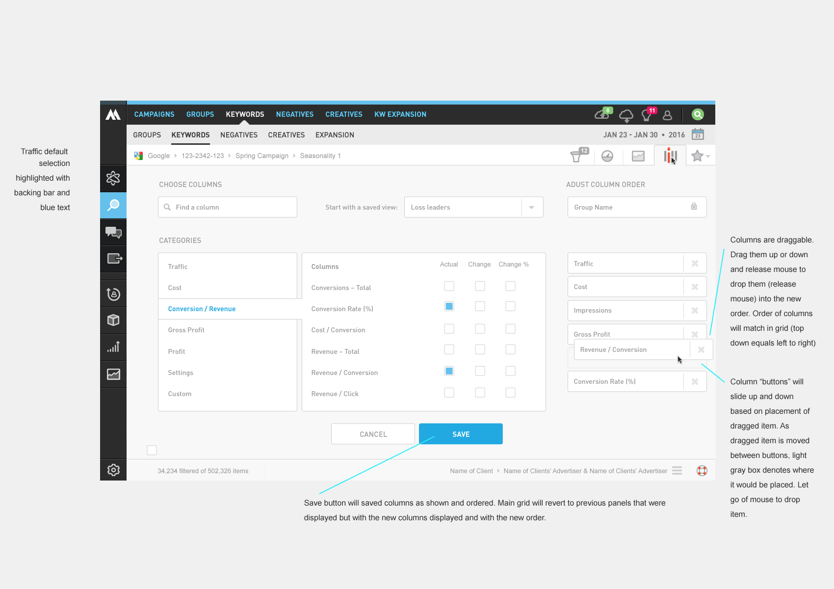
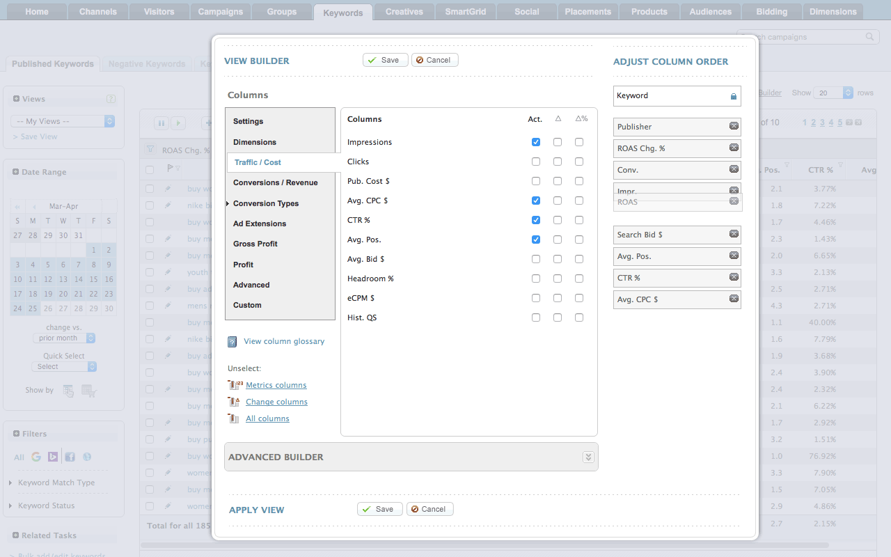
How are we going list hundreds of metrics for users to choose from?
Read the Case Study
Through the years, the site had been piece-mealed together. Lets unify the look, reorganize, and restructure.
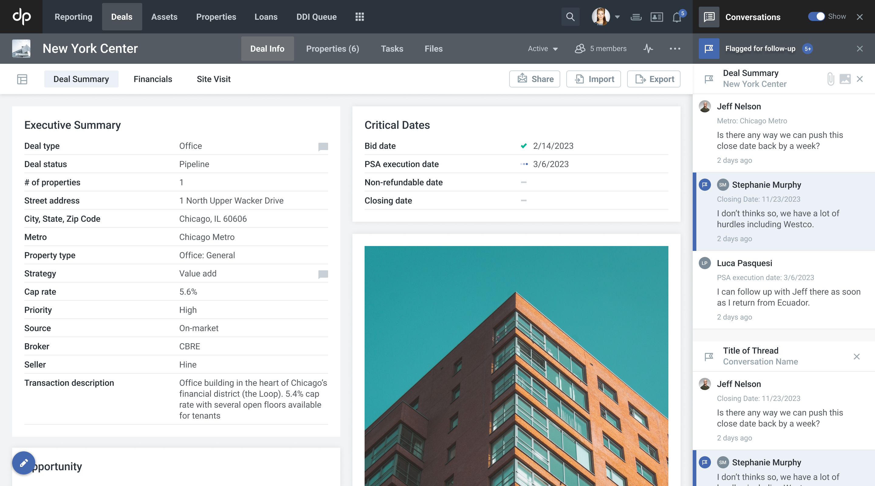
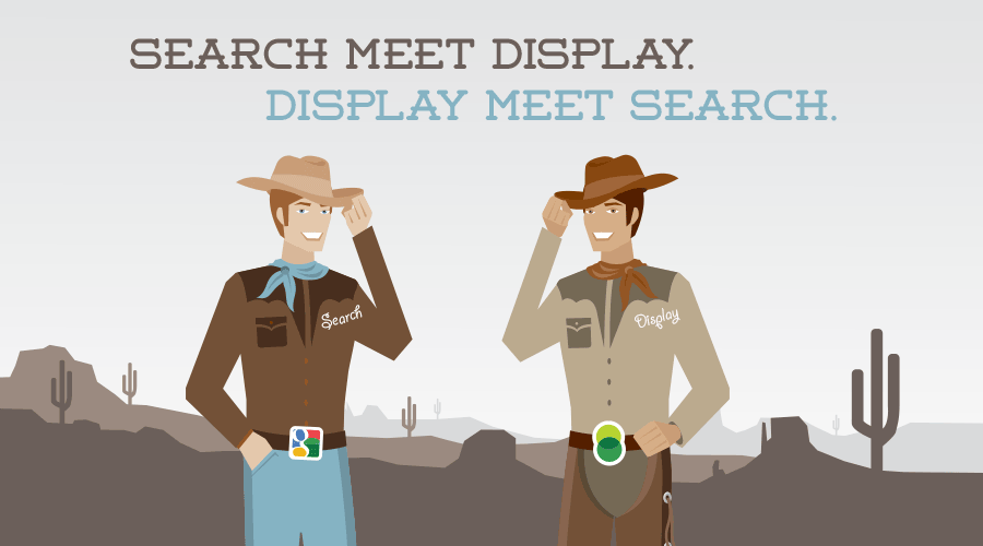
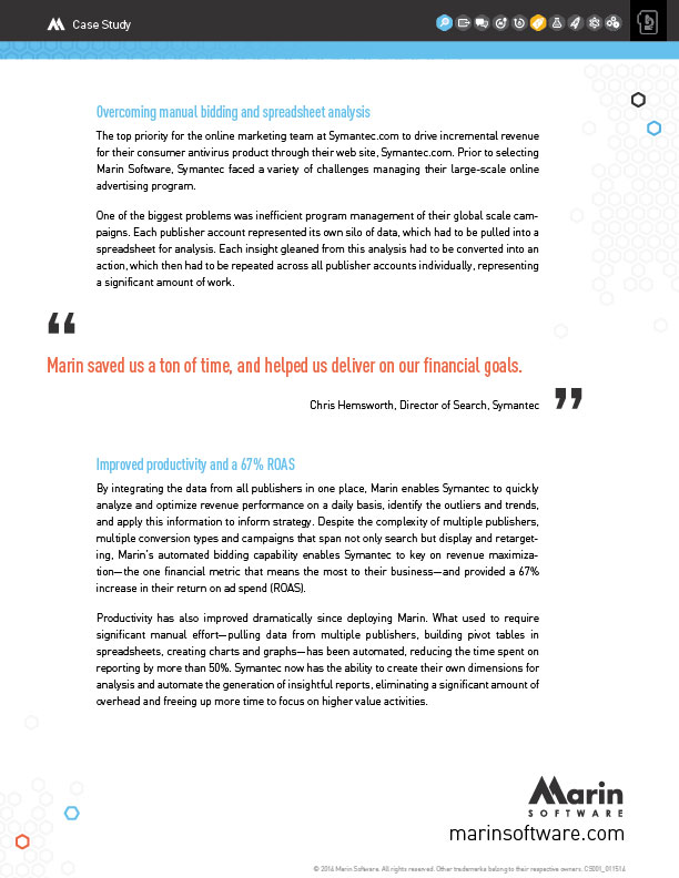
Read the Case StudyAt Marin Software, I led design on a search engine marketing platform that helped advertisers manage spend across publishers, accounts, and clients. Unlike the free tools publishers offered — which were designed to maximize the publishers' own revenue, not the advertiser's — Marin's value was cross-publisher visibility and automation. Where a team of ten could previously manage a few million in monthly spend, our platform let clients scale from $5–10M up to $100M+ per month by automating bidding against their actual business goals.
A critical part of that value was surfacing the right metrics. Publishers like Google, Yahoo, and Microsoft deliberately limited the metrics available in their tools, surfacing only what encouraged higher bids and more clicks. We built beyond that — giving users access to revenue, conversion, and ROI metrics that put performance in full business context. The phrase we used internally: "beyond the click."
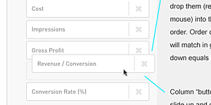
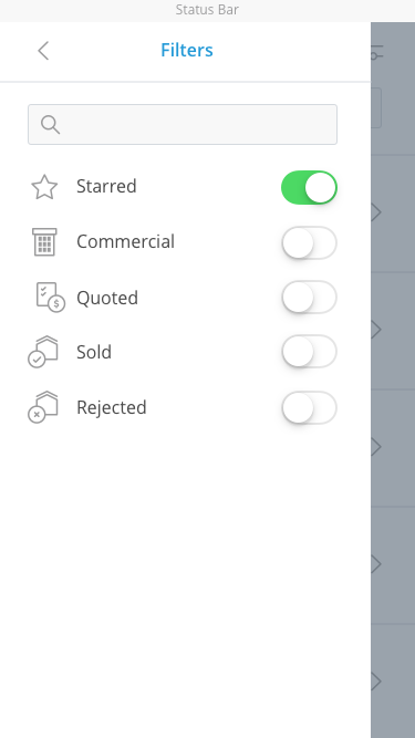
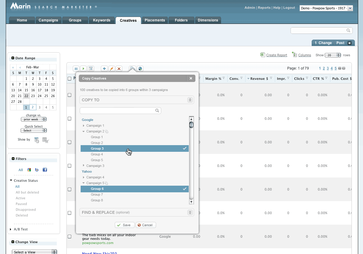
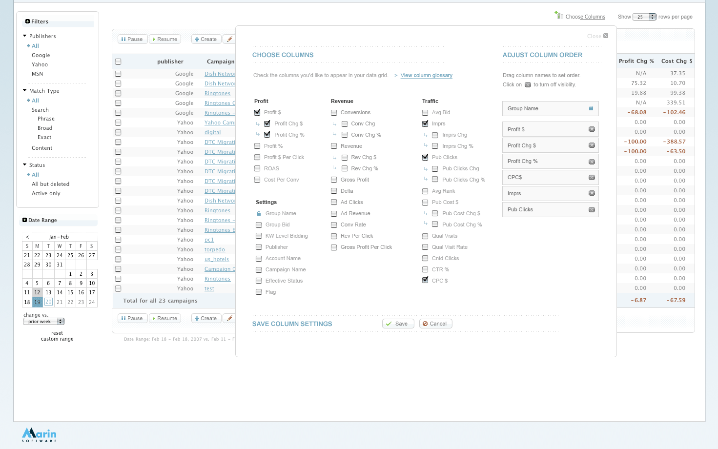
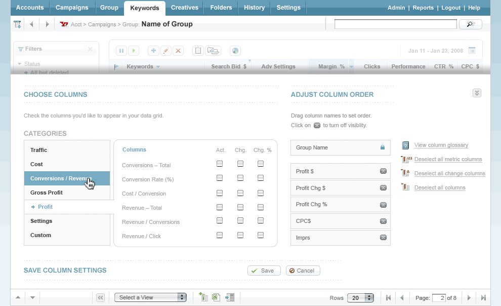
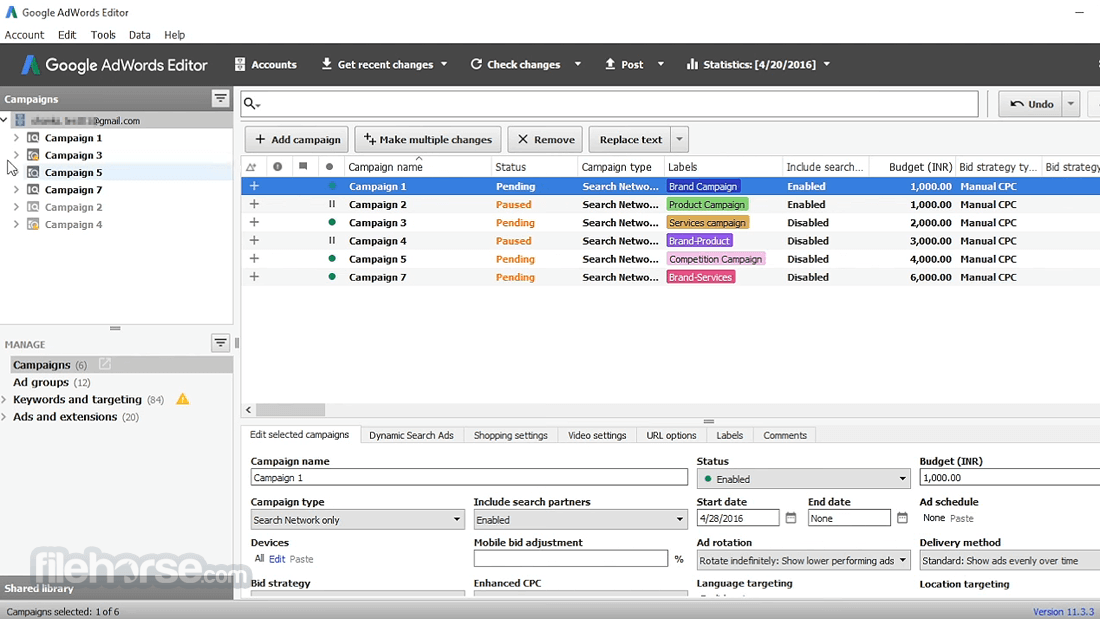
As our metric library grew past 30 columns, users needed a way to manage what they saw. The checkbox modal we'd built early on wasn't going to scale. We needed a column chooser that could grow with the product — and do it before Google built their own.
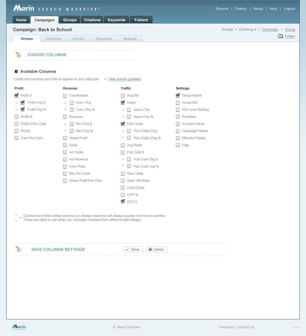
We were only using checkboxes to choose columns, which in time, became tried and true. However, the number of metrics available in our product were outgrowing this approach.
Back in 2006, column choosers were essentially nonexistent in ad management tools. None of the major publishers offered one. The few we found in adjacent tools used simple checkbox modals — the same pattern we were already outgrowing.
This was also a moment of broader UI evolution at Marin. I was deep in exploration work to update the product's overall look and feel, but we made a deliberate call: ship the column chooser fast, iterate later. Competitive timing mattered more than perfection.
Our primary users were search advertising power users — part analyst, part marketer — who lived in the product 3–5 hours a day. They were fluent in Google's tools, comfortable with Excel for cross-publisher analysis, and accustomed to high-density data interfaces. They needed speed and precision, not hand-holding.
Secondary audiences included internal customer success and product teams, marketing managers, and executive stakeholders.
I worked with our Director of Product Management and a front-end developer. I owned the design — layout, UI components, interaction patterns, and UX direction. The developer and I had a close working relationship, having built out most of the product's front-end together.
Our research started with a thorough audit of publisher tools and display advertising platforms (including DoubleClick and SDC, from my agency background). The finding was consistent: nobody had solved this well. That was both a challenge and an opportunity.
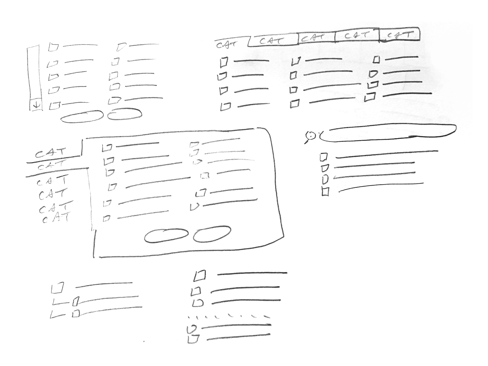
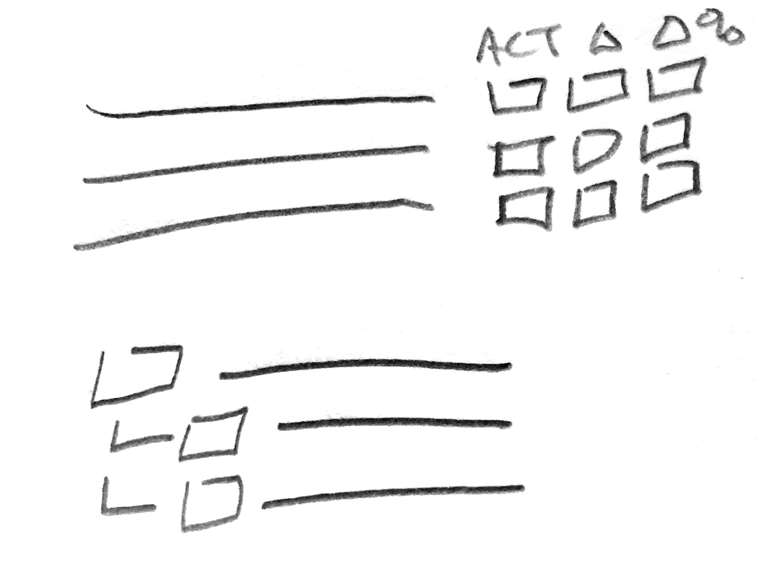
I sketched several approaches and landed on a core organizing principle: categorization. Rather than forcing users to scroll a flat list of 100+ metrics, we grouped them into logical buckets. This served two purposes — it made discovery faster, and it helped users find metrics they didn't know existed.
We explored three or four categorization schemes, tested the strongest candidates with our Customer Advisory Board and internal customer success team, and synthesized the feedback — which, as expected, pulled in multiple directions — into a workable direction.
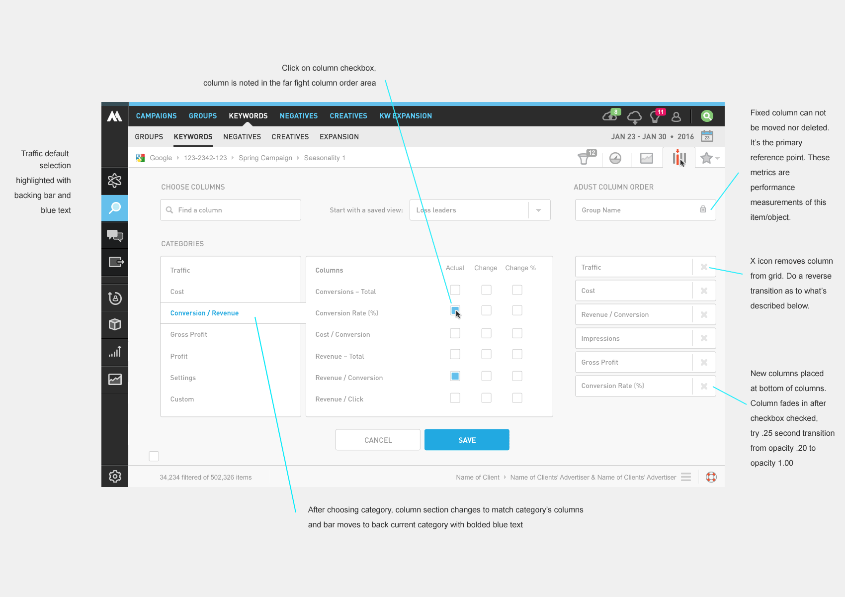
One interaction problem became clear early in the process: if users had to select columns in the modal and then navigate back to the grid to reorder them, the back-and-forth would be frustrating. We resolved this by building column reordering directly into the chooser — select and sequence in one place.
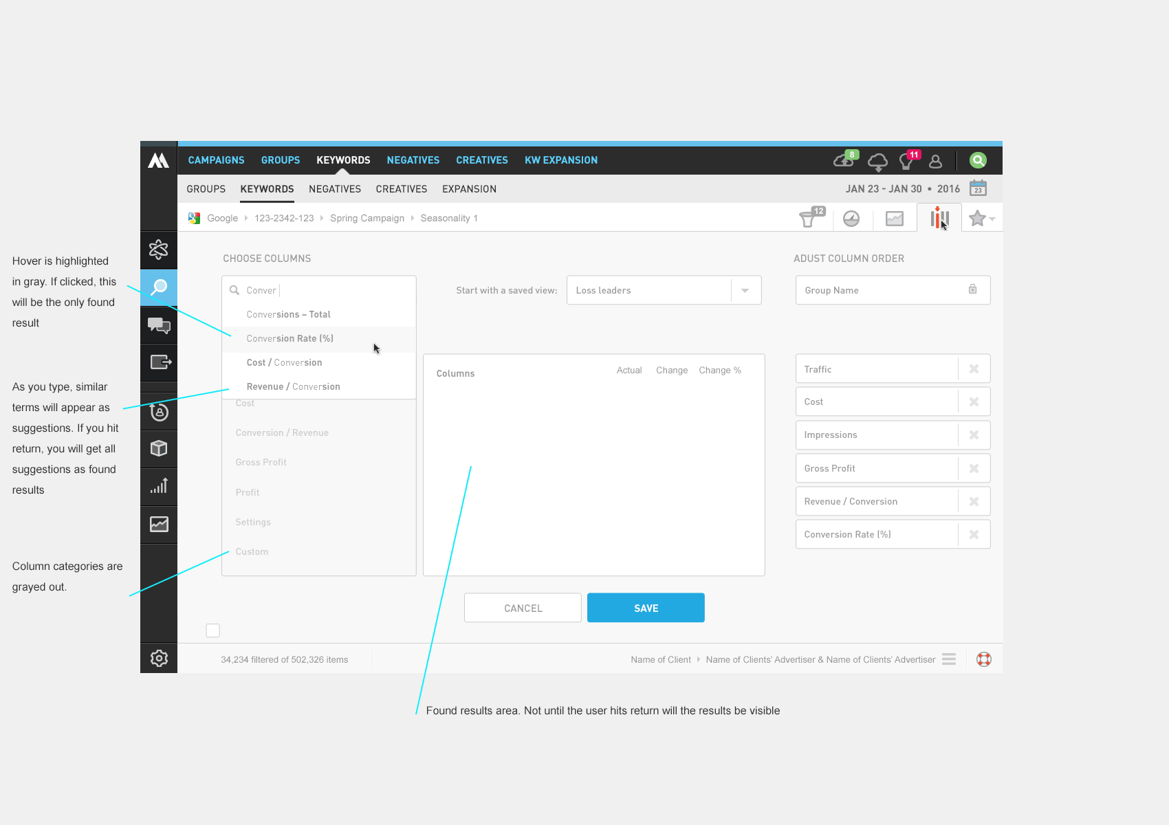
We also added search within the chooser, giving power users a fast path to any metric by name.

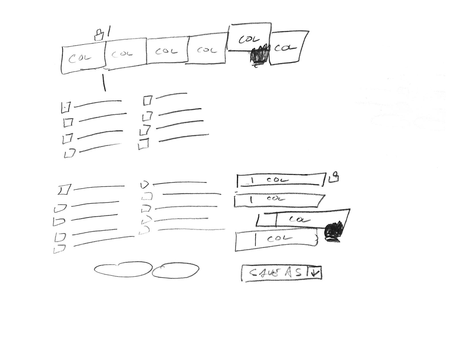
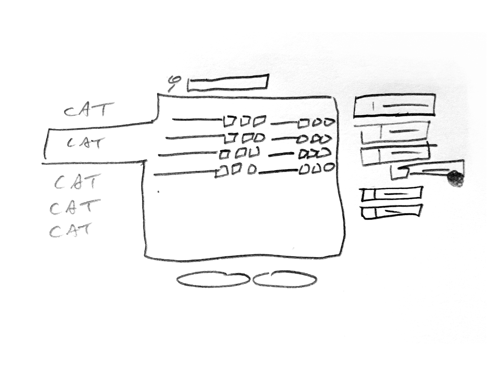
We build a pretty solid MVP, while making the decision to iterate and advance the feature after gathering customer feedback.
I worked with our front end developer to get the look and interactivity pretty tight including ways to change the column order, displaying the found search results, and how to show/hide the columns.
The upgraded column chooser launched to strong adoption. At the time, users had no way to show or hide columns directly from the grid, so the time savings were immediate and tangible. It also became a sales asset — the breadth of our metric library, now navigable and discoverable, reinforced our "beyond the click" positioning against publisher tools.
Columns per saved view: 4.2 → 8.7 — A 2x increase post-launch, indicating users were genuinely customizing their workspaces rather than accepting defaults — a strong signal the categorization and search features were working.
Grid screen engagement: ↑ Active users — Measurable increase in active users on the core reporting screen post-launch, validating that a more powerful column chooser drove deeper engagement with the product's most-used feature.
Sales win rate vs. Google: ↑ 20–30% — In head-to-head evaluations against Google's tools — which still relied on a limited checkbox modal surfacing only publisher-favorable metrics
— our win rate increased meaningfully. The ability to demonstrate a richer, more flexible view of cross-publisher performance resonated strongly with prospects who had outgrown what the publishers were willing to show them.
We also tracked chooser interactions via Google Analytics click events and found usage patterns were consistent across the metric set — a reassuring signal that the categorization was working and users weren't clustering around just a few familiar options.
When Google eventually released their own column picker — a checkbox modal that closely resembled our earlier version — we were already shipping the next iteration. By the time our redesigned UI launched in 2017, the column chooser was a highlight.
The project reinforced a few things I carry forward: iterative releases let you stay competitive without waiting for the "perfect" version, and building for discoverability can be as valuable as building for speed. We were able to release right after Google shipped their version, then quickly advance past it — a competitive dynamic that validated the iterative, agile approach over a longer waterfall build.
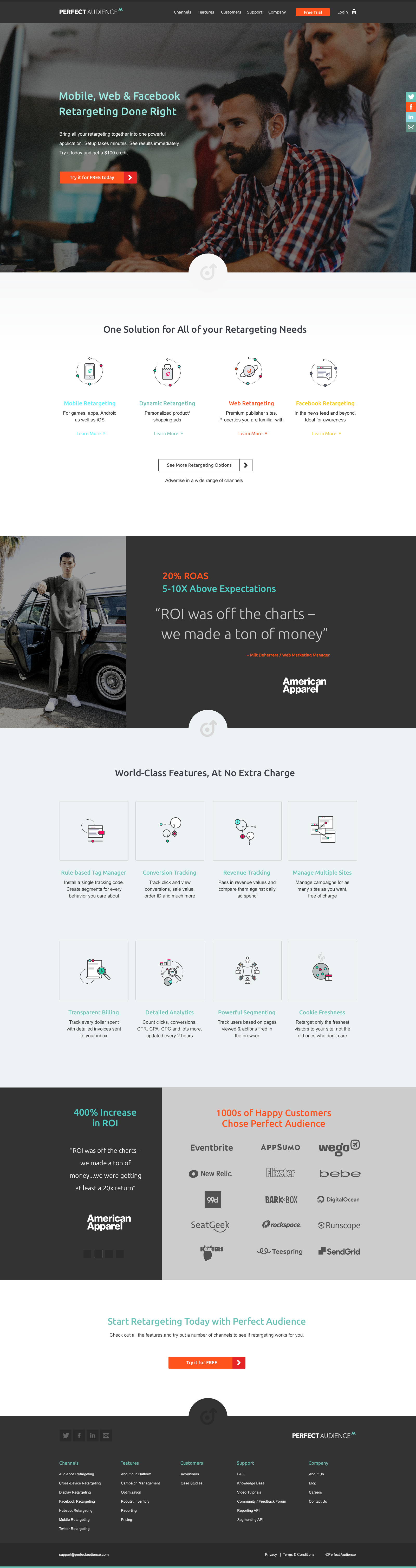
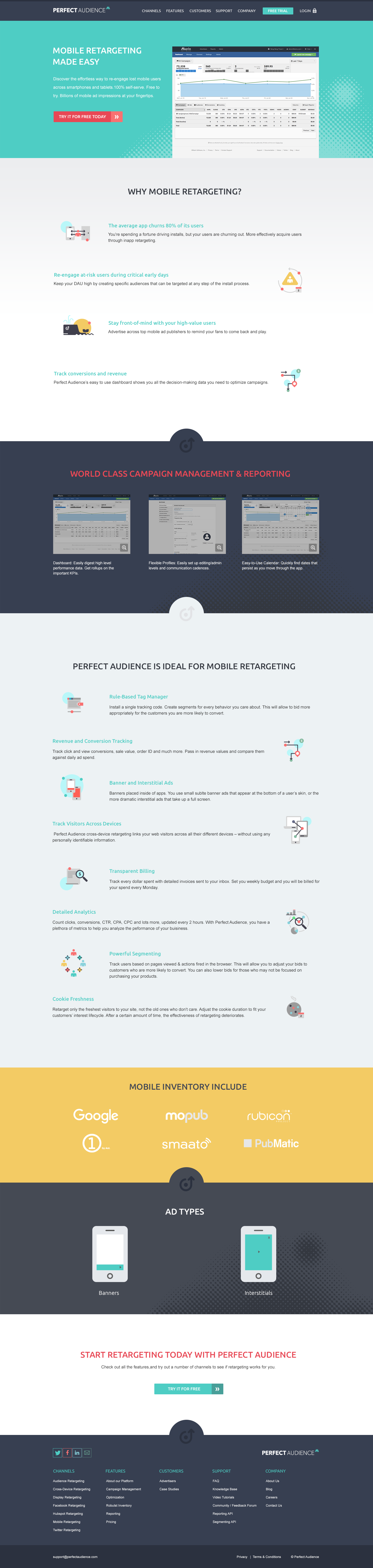
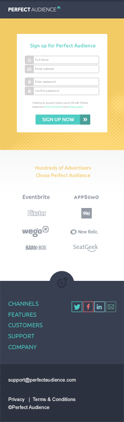
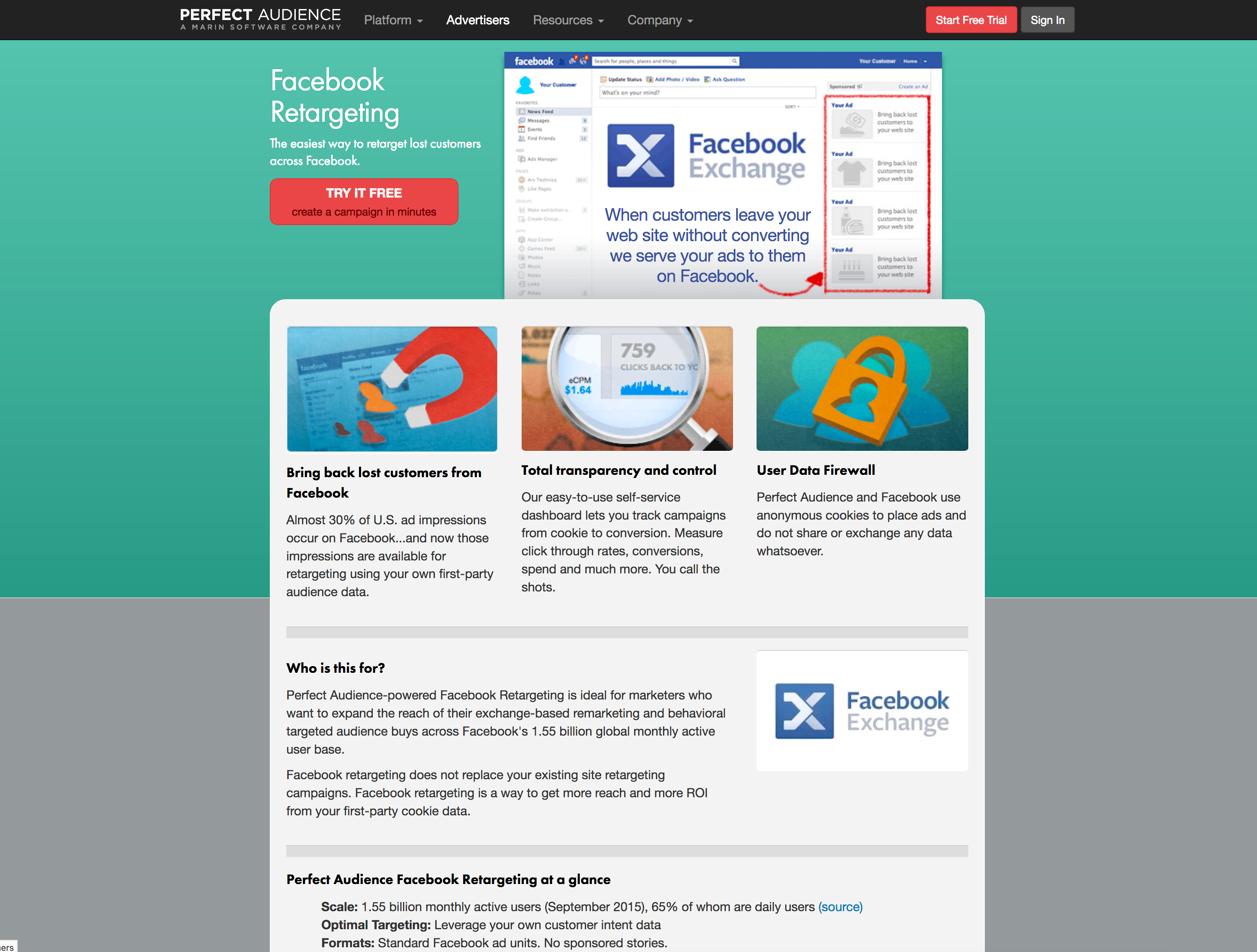
While working at Marin Software, we acquired a display ad retargeting company named Perfect Audience — a self-serve banner retargeting platform built for small and medium businesses looking for a lower-cost alternative to search advertising. At the time of the acquisition, their management team, and even individual contributors, were very hesitant to update the content on their site or refresh its look. The SEO was performing well and the business was running steadily, so there wasn't a perceived need to make changes. A few years later, the Marin Software management team and a new general manager finally recognized that the business might do even better with an up-to-date marketing site.

The team added pages to the site as they added products/features through the years – which led to some inconsistencies as users navigated from page to page. The users had to reset thier context with almost every new page they visited.
The team had added pages over the years as they added products and features, which led to significant inconsistencies as users navigated from page to page. Visitors had to reset their context almost every time they landed on a new page. After reviewing the site, we found the content structure was all over the place, layouts were inconsistent across pages, and icons had been designed in over ten different styles — as if ten different designers had each done their own take. The site looked dated, likely designed around 2010, and hadn't kept pace with the product's evolution.
That's a lot of styles for the icons.
Four years earlier, after running into a number of roadblocks and with limited resources available, our team had decided to focus efforts elsewhere and let the site run its course. We weren't looking to blow it up entirely — just modernize it and bring it in line with our other Marin web properties – marinsoftware.com, insights.marinsoftware.com, support.marinsoftware.com.
Flash forward four years: I returned to Marin Software to take care of a number of special projects, and after completing those, the Perfect Audience redesign landed on my plate. The business was gaining traction, and the need for a refreshed marketing site was more urgent than ever.
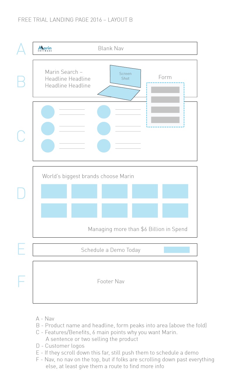
Before diving into research and design, the team aligned on a clear set of objectives and measurable outcomes to define what success looked like for this project.
The primary audience for the site was performance marketers, mostly from small and medium businesses comparing low-cost online advertising products and channels. These were hands-on practitioners who ran their own campaigns day-to-day. They needed to digest information from the site quickly and decide whether it was worth testing the product — which meant the redesign had to reduce friction in that decision-making process. Every additional page they had to wade through before finding a clear answer was a potential dropout point, making the 20% reduction in pages-to-conversion a particularly meaningful target.
A secondary audience was Marin Software's internal client services group, which ran ads for some of Marin's larger enterprise clients. This team was actively pitching display ad remarketing to clients as a lower-cost alternative to search. They needed polished, credible content to walk marketing managers through the retargeting offering across multiple channels. For this group, lead quality and ease of sharing content were the more relevant success metrics.
I executed the research, information architecture, wireframing, visual design, and front-end coding of the site, and also edited content to fit the new structure. I ran all work by our Creative Director, the Managing Director of the Perfect Audience business unit, an engineer on the product team, and the product manager. The product marketing manager and our editor wrote and edited three new product and feature pages for the site.
I reviewed a list of competitors the team forwarded and also sourced inspiration independently. One standout was Recurly, which used a subtle isometric parallax effect that added visual depth without overwhelming the content. Recurly here. I then pitched the team on architectural adjustments and proposed a more consistent, modular content structure.

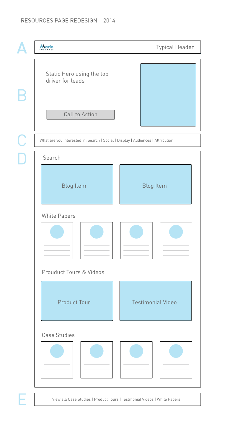
Site Architecture & Wireframes: The content structure was very inconsistent with the prevous site. We wanted to make it more consistent and modular.
After auditing the existing content and reviewing well-structured competitor sites, we determined we only needed 4–5 distinct layouts to cover the entire site — a direct answer to the design consistency key results we'd set at the outset. I wireframed those layouts and got team buy-in with minimal revisions on the first pass.
Drawing on the Recurly inspiration, Version 1 used angular hero sections with a parallax effect and line-based icons to complement the text. While visually interesting, the screens started to feel repetitive, and the icon style risked feeling dated by the time the site shipped.
Version 2 introduced a broader color palette and halftone patterns for visual texture. Icons were redesigned in a flat style to avoid the thin/thick line trend that was already showing signs of aging. This gave the client a meaningful alternative to evaluate.

V2 • Going with a super flat style here. I'm using placeholder icons in there that I was going to customize if we went with this approach.
Version 3 presented a more conservative direction that relied on photography in hero sections rather than illustrations or product screenshots. Given the limited budget, this would mean stock photography — but it offered a grounded, professional feel as a contrast to the more illustrative approaches.
V3 • Going with a super flat style here. I have placeholder icons in there that I was going to customize if we went with this approach.
After reviewing all three directions with our Creative Director, we iterated with incremental refinements before presenting to the Perfect Audience team. During that presentation, we were leaning toward Version 1 when I suggested trying to merge the strongest elements from all three versions: the angled boxes, halftone patterns, flat icons, and broader color palette. I wasn't sure it would work — combining that many visual elements is a risk — but it was worth exploring. We went with this direction, and it became the design that shipped.

V4 • We tried out mixing and matching the elements from the previous three and guess what, we ended up going with this direction.
Before the research phase even began, I had a conversation with our Creative Director and the Perfect Audience engineering team about what was working on the existing site and what wasn't — specifically why the site had gone so long without updates and why content inconsistency had become such a problem. Protecting the site's existing SEO performance was a hard constraint throughout, meaning any architectural changes had to be managed carefully to avoid disrupting rankings.
After that alignment, we decided to keep the technical implementation simple: a Bootstrap-based responsive build deployed on WordPress. WordPress gave us handy shortcode support, flexible menu management, and built-in SEO features — and while the team wasn't going to be updating it like a blog, it made the site maintainable enough that a production coder could go in and update content periodically without engineering support. That directly addressed the maintenance key result we'd set at the start of the project. A designer or developer who knows how to code could add new pages as needed, and simple content edits could be made without touching the underlying structure.
After navigating a few back-end and operational headaches, the site launched successfully. Archived here. I moved on since, but have heard the site was doing well. The new architecture brought the page layout count down to the 4–5 modular templates we'd targeted, the icon system was unified, and the content flow was significantly more coherent for both SMB performance marketers and the internal client services team pitching retargeting to enterprise clients. I moved on from the project shortly after launch, but heard back that the site was performing well.
The project reinforced a few important lessons. Implementing a challenging design in code is harder than it looks on a mockup — working through that alone gave me genuine empathy for the developers I've collaborated with over the years. I also learned that even a well-considered responsive design leaves a long tail of edge cases at odd breakpoints; working through those requires both creative problem-solving and tight collaboration between design and development — even when, as in this case, those two roles were the same person.
Check it out an archived version of the siteWhen I joined Knowledge Architecture, they had a great foundation for a Slack-like app that was deeply integrated with industry-exclusive architectural software (DAM, CAD, Project Management, Budget tools). This integration made it stick, and it was also used to create a social environment where industry knowledge could easily be produced, retained, and shared.
At the time, creating posts was a somewhat tedious process, and really only supported a single path to adding elements such as video, images, blueprints, project plans, and a number of other elements — typically through a hybrid finder/browser tool.
For the creation of posts, the majority of users were power editors who tended to be more engaged with the app. By making it easier for them to create posts, they would more likely advocate for the adoption of our product and its features throughout their organizations.
The audiences for this feature were senior and junior-level architects, power editors, and internal implementors of our products, primarily system administrators from IT departments. Our goal with this project was to make the posts feature accessible and intuitive for all of them.
Knowledge Architecture was a small company of only 10 employees, so everyone wore multiple hats. For this project, we had a product manager who was also the CEO, a researcher who doubled as a client services rep, a front-end engineer, and myself handling design.
The look and design patterns for the app were fairly established, so I was mostly designing to existing conventions. However, some of those patterns had flaws and limitations, making it a challenge to move the design forward without blowing it up entirely.
Our client services and product person was reaching out to implementors and power editors to help us understand the priorities and needs of our user base. The CEO reviewed this research and prioritized the feature accordingly.
My role was to work with the product manager to research analogous tools and identify the best ideas worth borrowing from. We looked at Slack, Medium, Twitter, and Facebook — trying to incorporate their strongest patterns without burning through our very limited engineering resources.
From there, I sketched out user flows and iterated based on team feedback. The goal was to let users choose from multiple file types (surfacing only the ones compatible with the post format) and add them either through the existing finder or via drag and drop. The finder was halfway there already. For the purpose of this case study, I'll focus on the drag and drop interaction.
I then designed pixel-perfect mockups of the post editor — including touching up icons — and worked through the finer details: how objects would appear mid-drag, whether they'd change color, whether there'd be loading indicators, how placement zones would be communicated, and what would happen when multiple items were selected.
We explored several visual directions, including an early version that kept everything in grays to stay close to the inherited style. Eventually, we landed on an approach that introduced a bit more color than was used elsewhere in the product. I flagged this as a deliberate design decision, and the team was aligned on the new direction.
To help everyone understand how dragged items would interact with existing text in the post, I animated the interaction. The team responded enthusiastically — and it helped move the project forward faster than static mockups alone would have.
Throughout the process, we were checking in regularly with our front-end and back-end engineers to make sure we weren't backing them into a corner or creating scope that would balloon the timeline.
To get a better feel as to how items adjust the current text in the post, I animated how the interaction would look and the team was excited with this approach.
The feature shipped cleanly and landed well. What had previously been a single, friction-heavy path to adding content to a post became a fluid, multi-path experience — one that felt native to the workflows architects and power editors were already in.
The response from power users was immediate and positive. Several noted that the feature should have existed sooner, which — while a mild indictment of the old experience — was a strong signal that we'd gotten the new one right.
More meaningfully, post creation increased noticeably in the weeks following the release. Users who had previously authored posts infrequently began contributing more regularly, and a portion of users who had never published a post at all started doing so for the first time. Removing the mechanical friction of adding images — the most common media type in architectural project discussions — turned out to be a meaningful threshold moment for casual contributors.
For power editors specifically, the drag and drop interaction aligned with behaviors they already used across other tools in their stack, which reduced the learning curve to near zero. That familiarity made them faster to adopt and faster to evangelize the feature within their organizations — exactly the advocacy flywheel we were designing toward.
This project also reinforced something I now carry into every interaction-heavy feature: animating the proposed behavior isn't just a presentation flourish — it's a design tool. Seeing the interaction play out in motion surfaced questions and alignment issues that static screens simply don't reveal, and it accelerated buy-in across the team in a way that compressed the feedback cycle considerably.
The drag and drop image feature also laid the groundwork for a broader roadmap of supported media types — blueprints, project plans, CAD files, and more — giving the team a repeatable pattern and a user expectation to build on.
This is what I do well
If you need a great idea. Or if you need to make a good idea great, or a great idea better, I'm here to help. Maybe you just need the finishing touch to pull it together. Through it all, I've always tried to keep keep the ball rolling.
Even though I've taken on my share of UI/UX work, I love adding the final polish to my work. If you need design to go beyond wireframes, give me a call. Visual design can't always be learned.
I've designed and redesign a wide range of sites through the years. Multi-lingual, wordpress, blogs, marketing sites, landing pages, you name it, I've done it. As someone who knows how to code, I will not paint developers into a corner.
Through the years, I’ve worked with and mentored over 25 designers. Knowing how to communicate with fellow designers while keeping them excited and engaged takes polish. Reconginzing when something is working well design-wise, even if it's not specificly the way you imagined it – is an art form in itself.

‘Chad is a brilliant designer with unequaled work ethic, business knowledge and people skills. I would recommend Chad to anyone and everyone.’
Dan McComas / Former SVP of Product / Reddit

‘Chad is an outstanding manager to work for and possesses strong business knowledge, along with having excellent skills as a graphic designer who can turn around projects at a high level and speedy pace.’
Jamie Pulley / Web Designer / Ziff Davis

‘Chad is a brilliant Art Director. He has not only great design/creativity skills, but also is a fantastic manager.’
Gaurav Kumkar / Technical Director II / ELectronic Arts

‘The Home Depot guys came in and reiterated how they love the UI of the Marin App. It’s so easy to use. They even mentioned that everything you guys created gets copied by everyone else.’
Derek Yuan / Former Director of Product Management / Marin Softare

‘Chad was an excellent member of our team. He provided solid, yet creative direction on all the web projects we worked on. He was a mentor to all on the team. Always a pleasure to work with.’
Lalena Shea / Marketing Communications Specialist / Fujitsu
I'll get back to you shortly

